Hi everybody, I hope you guys can spend a little time to help me check my Ielts writing task 1. Thank you very much !
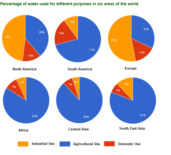
Topic : The chart below show the percentage of water used for different purposes in six areas of the world.
Summarise the information by selecting and reporting the main features, and make comparisons where relevant.
The pie charts below describes how six regions in the world utilized water with unalike purpose.
At first glance it is clear that countries from Africa, South America and Asia used water mostly for agriculture purpose while a very large majority of water in North America and Europe were used for industrial needs.
As can be seen from given pie charts, in North America and Europe, water was used mainly for industry which account for 48% and 53%; compare with a small amount of areas in Africa and Asia. More than 80% water in Africa and Asian regions went in agricultural field while this percentage was only 32% and 39% in North American parts and Europe. Percentage of water use for household in South America higher than other regions at 19%, whereas a very small number of people in Africa and Asia areas use water for personal use at home.
water for households and for industry
Topic : The chart below show the percentage of water used for different purposes in six areas of the world.
Summarise the information by selecting and reporting the main features, and make comparisons where relevant.
The pie charts below describes how six regions in the world utilized water with unalike purpose.
At first glance it is clear that countries from Africa, South America and Asia used water mostly for agriculture purpose while a very large majority of water in North America and Europe were used for industrial needs.
As can be seen from given pie charts, in North America and Europe, water was used mainly for industry which account for 48% and 53%; compare with a small amount of areas in Africa and Asia. More than 80% water in Africa and Asian regions went in agricultural field while this percentage was only 32% and 39% in North American parts and Europe. Percentage of water use for household in South America higher than other regions at 19%, whereas a very small number of people in Africa and Asia areas use water for personal use at home.

de_bai.png
