TASK 1. Revenue sources and expenditures of USA Charity in One Year.
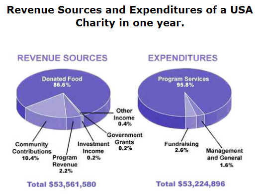
The pie charts present the amount of charity income and the way it is spent during one year in USA. It is clear that, mostly source of revenue dominated by donated food, while almost all of the financing are used for program services.
Looking further at the detail, over one year, American people evidently engage themselves more focus on giving food at 86, 6%. Afterwards, they also believe community contributions is the second manner to donate their kindness with at only 10.4%. Meanwhile, in the big three of aid resources occupied by program revenue at 2.2%. Moreover, other resources are earned the investments just showing at less than 0.5%.
On the other hand, apparently USA people more consider to donate their cost in program services. It can be seen that the allocation of this source at 95, 8 %. Meanwhile, other sorts like fundraising, and Management and general both just share at only 4, 2%. Astonishingly, between income and expenditure sources seemingly is not balance, it is evident that there is a rest about $336,684 from totally amount of revenue at $53,561,580.

ES7.png
