Unanswered [1] | Urgent [0]
  

Home / Writing Feedback   % width   Posts: 2


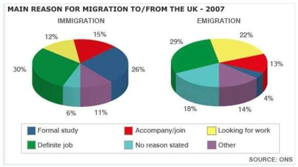
The pie charts show the main reasons for migration to and from the UK in 2007.


Thao Vy 1 / -  
Mar 10, 2021   #1

Uk - immigration and migration statistics


The given charts demonstrate the percentage of different reasons for immigration and emigration in England in the year 2007.

As can be seen from the pie charts, it is obviously evident that while the most popular cause for residents arriving from and to the UK was their occupation, the immigration for no reason as well as the emigration for studying abroad were the lowest proportion.

As the illustration suggests, the definite job reason for both migrations represented the majority of total, equivalent to about a third. The allocation of formal study cause accounted for 26%, which was higher than the accompany reason nearly a half figure. Seeking jobs and other reasons were the fourth rates, made up similarly the allocation of 12%. This number was obviously double that of no reason stated for British people moving to this country.

According to the emigration chart, looking for work and no reason stated occupied 22% and 18% respectively. An interesting notice is that the proportions of joining reason as well as others constituted approximately 13%, which tripled that of formal study.

  • IELTSAcademicTask.jpg


Holt  Educational Consultant - / 15385  
Mar 11, 2021   #2
Remember that you are reporting based on an image that the reader will not be able to see. Therefore, you need to be specific about certain aspects of the prompt summary. These include, but are not limited to:

- The type of image
- Number of images
- Overview of each image section/content
- Trending statement for each image

Your summary overview is, in my opinion, lacking in the required details and does not properly help the reader create a mental picture of the information you are providing. I mean, sure, you identified the pie charts, but you did not give the number of images and what these represent as a part of the summary, which would have helped create the mental picture I was telling you about earlier.


Home / Writing Feedback / The pie charts show the main reasons for migration to and from the UK in 2007.
Need Writing or Editing Help?
Fill out one of these forms:

Graduate Writing / Editing:
GraduateWriter form ◳

Best Essay Service:
CustomPapers form ◳

Excellence in Editing:
Rose Editing ◳

AI-Paper Rewriting:
Robot Rewrite ◳

Academic AI Writer:
Custom AI Writer ◳