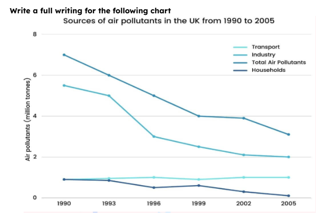
The line chart illustrates the amount of contaminants emitted in the UK from 1990 to 2005
Broadly speaking, the chart indicates a downward trend in all categories, with total air pollutants and industry emissions plummeting over time, whereas household and transport emissions remained relatively stable.
Examining the figures, the total air pollutants stabilized at their highest level, albeit dropping steadily from 1990 to 1999. It stayed unchanged until 2002, when it fell to its lowest point in 2005. Industry shared the same trend, but without an end until it hit rock bottom at the end of the surveyed year
Transport and household had the same starting point. Nevertheless, pollutants from transport stayed unchanged all the time, while it was not the same for households, as it gradually decreased and hit the lowest point of the chart in the end.

essay.PNG
