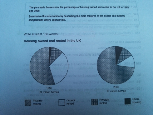
The pie charts below show the percentage of housing owned and rented in the UK in 1985 and 2005. Summarize the information by describing the main features of the charts and making comparisons where appropriate.
The comparison of the housing owned proportions in the UK between 195 and 2005 is illustrated in the pie charts. It is immediately apparent from the figures that privately owned overtook leading position than others. Whereas, one of them experienced a dramatic decline.
In 1985, privately owned showed the domination percentage than other and stood at approximately 60% and the second which obtain the numerous proportion is council rated, accounting for 45%. However, there was a significant decline in council rated of 15% in 2005. In addition, 2005 experienced a dramatic increase of privately owned and peaked at virtually 75%.
Less change was showed by privately rented and virtually no any changes in 2005 still in 15%. There, on the other hand, was a significant increase in social housing in 1985 at a very small number and...

223029_1_o.jpg
