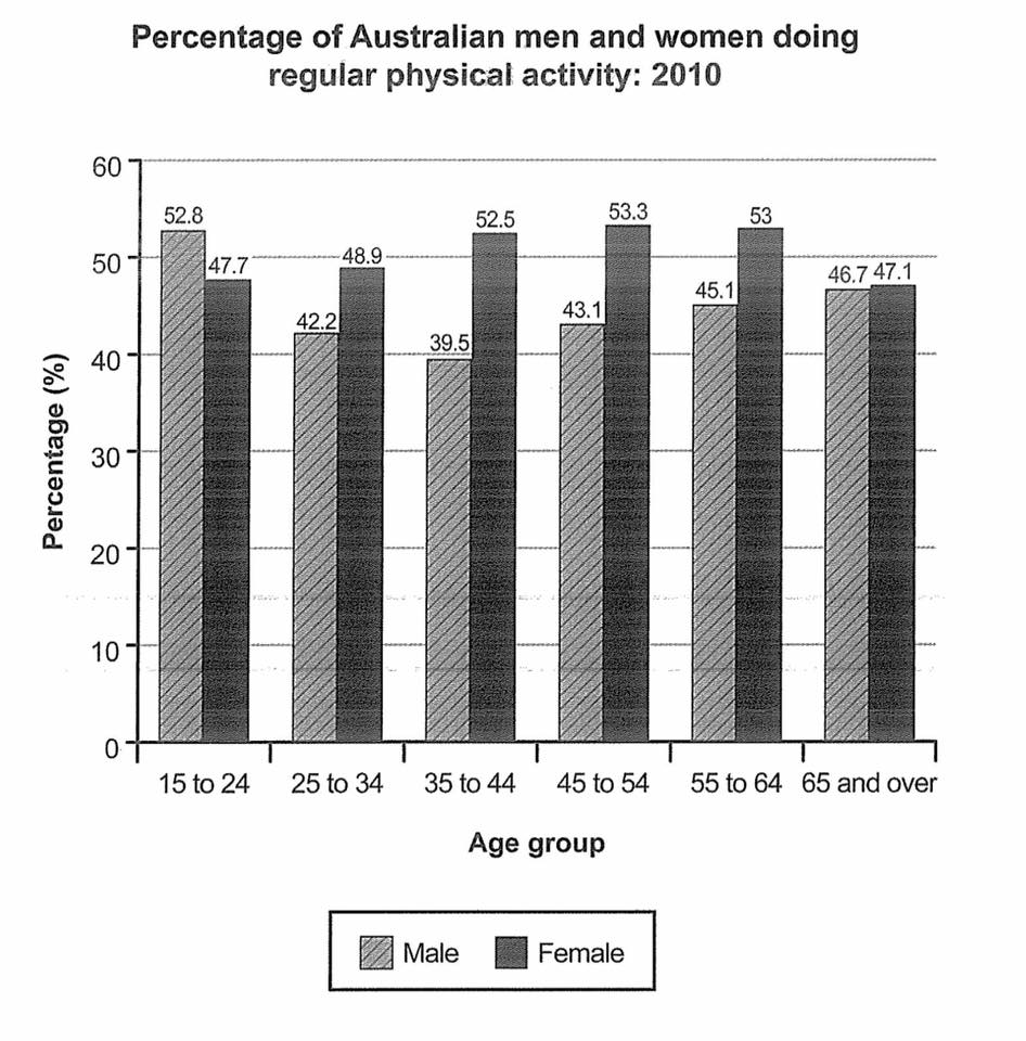
The bar chart below shows the percentage of Australian men and women in different age groups who did regular physical activity in 2010.
Summarise the information by selecting and reporting the main features and make comparisons where relevant.
Write at least 150 words.
The bar chart present the proportion of Australian in different sex and age group who are doing physical activity regularly in 2010.
Overall, the bar chart illustrate the female in Australia are more likely to do physical activity than the male, which the average proportion of male is 45% while the female is 50%.
In terms of male, the proportion of age between 15 and 24 are broke through 50% to 52.8%. It is the only age group of male that can higher than the female, also is the highest proportion compare with all male's age group. On the contrary, the age between 35 to 44 is the only group that less than 40% of male doing physical activity regularly, account 39.5%, also it is the lowest group between all male' age group.
In terms of female, the age between 45 to 54 account 53.3%, 0.3% and 0.8% slightly higher than the age between 55 to 64 and 35 to 44, respectively, to be the top between all female's age group. On the contrary, the age between 65 and over have the lowest proportion, account 47.1%.
In term of difference between male and female, there are two age group make a difference higher than 10%, which the others can not, which is age between 35 to 44 and 45 to 54. Only have a disparity of 0.4% make the group of 65 and over become the littlest difference between all age group.
I have a question :
Do i need to use all data or not ? (I think it will make my article much long and pointless if i use all data)
Please give me an advice for improve, Thank you.
Summarise the information by selecting and reporting the main features and make comparisons where relevant.
Write at least 150 words.
Were Australians physical active in 2010?
The bar chart present the proportion of Australian in different sex and age group who are doing physical activity regularly in 2010.
Overall, the bar chart illustrate the female in Australia are more likely to do physical activity than the male, which the average proportion of male is 45% while the female is 50%.
In terms of male, the proportion of age between 15 and 24 are broke through 50% to 52.8%. It is the only age group of male that can higher than the female, also is the highest proportion compare with all male's age group. On the contrary, the age between 35 to 44 is the only group that less than 40% of male doing physical activity regularly, account 39.5%, also it is the lowest group between all male' age group.
In terms of female, the age between 45 to 54 account 53.3%, 0.3% and 0.8% slightly higher than the age between 55 to 64 and 35 to 44, respectively, to be the top between all female's age group. On the contrary, the age between 65 and over have the lowest proportion, account 47.1%.
In term of difference between male and female, there are two age group make a difference higher than 10%, which the others can not, which is age between 35 to 44 and 45 to 54. Only have a disparity of 0.4% make the group of 65 and over become the littlest difference between all age group.
I have a question :
Do i need to use all data or not ? (I think it will make my article much long and pointless if i use all data)
Please give me an advice for improve, Thank you.

a1.jpg
