WRITING TASK 3 - comparison of energy production
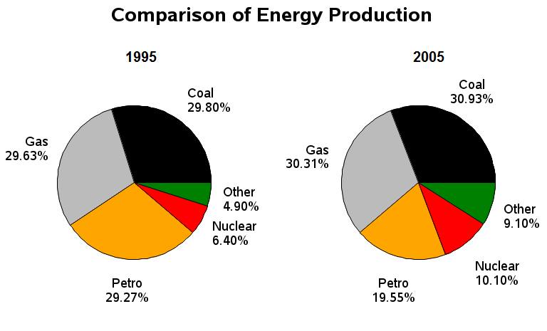
The pie charts show the proportion of energy which is produced in 1 decade, within 1995-2005. Overall, the significant increase showed by Nuclear and other energies, and the small amount of percentage presented by gas and coal, while the petro showed a sharply decrease.
Firstly let us look the increases of energy produced in 1995 and 2005. It is noticeable that most of the energy production lifted up. The coal increased 1,13 percent where the gas production increased only 0,68 percent. The highest production increase was Nuclear, where during 10 years it had 3,8 percent. Other energy showed also the 4,2 percent increased. Turning now to the decreased, the one and only energy production which went down in 2005 was petro. It showed specifically lessen approximately almost one in tenth.
Increasing level of energy production reached by others otherwise the decreasing level got by petro. Most of energy production had been increased within 10 years.

writing_task_3.jpg
