Unanswered [0]
  

Home / Writing Feedback   % width   Posts: 3


The proportion of the most favourite tourist choices in Brighton attentions over 3 decades 1980-2010


yogi07 4 / 2  
Jan 18, 2016   #1
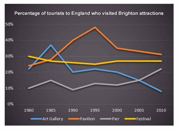
The graph illustrates the proportion of the most favourite tourist choices in Brighton attentions over 3 decades from 1980 to 2010. Overall, it is important to note that, despite some fluctuations, the top rank changed from Festival to be Gallery in 1985 that fell sharply after reaching the highest number, but then the Pavilion overtook in the next following years.

There was a dramatic rise in the level of tourists in Art Gallery and Pavilion. They began at a fairly similar level of at 20% to 25% in 1980 but while Art gallery tourists were a significant fall in 1985 after reaching a peak of approximately 40 per cent which was followed by a sudden jump and then gradually decrease. However, Pavilion overtook art gallery in 1990, as the most favourite destination and almost a half of total tourist visited in 1995. Following this, the number decreased gradually to finish the period at 35%.

Pier and festival had different pattern. Pier fluctuated during 2 decades, which hit a lowest of 10%, though there was a sharp increase for the last period. Then, the festival proportion virtually growth for 30 years between 27% and 30%

  • AvjbsYEI4t0tJpcLJAz7.jpg


vangiespen - / 4077  
Jan 18, 2016   #2
Hi Yogi, you did well in developing this essay. The facts are all in the report and you displayed an understanding of the graph that you were provided. The developed report is acceptable and can be understood by most readers. However, your grammar still needs work. That is something that does not happen overnight but can improve over time through practice. Now, let's try to edit your essay for clarity.

... favourite FAVORITE tourist choices PLACES... in AMONG Brighton attentions TOURISTS... ... from Festival to be Gallery... in 1985 that THEN fell sharply... ... next following years.

... of at 20%... were SHOWED a significant ... then A gradually decrease. ... favourite FAVORITE destination... a half of total touristS ...

... f Festival had A different... fluctuated during OVER 2 decades... lowest RANK of 1... f Festival proportion virtuallygrowth GREW for ...

You have the potential to write better essays. This essay in particular shows how you do your best to represent the information that you have in a logical, English thought pattern. The language as of now, is simple, which is alright at this point. Your writing is sure to improve over time.
Arundyna 12 / 14  
Jan 18, 2016   #3
hello, mr yogy, nice to read your writing,
actually you have ability to write well,
let me give you some sugestions

The graph illustrates the proportion of the most favorite tourist choices in Brighton attentions over 3 decades from 1980 to 2010. Overall, it is important to note that, despite some fluctuations, the top rank changed from Festival to be Gallery in 1985 that fell sharply after reaching the highest number, but then the Pavilion overtook in the next following years.

this my sentences.
An explanation regarding the percentage of visitors who visit tourist destination in Brighton over the course of 3 decades from 1980 to 2010 is illustrated in the line graph. overall, it clearly can be seen that, the entire figure looked significant fluctuation in the number of tourist. while the Art Gallery and the Vestival witnessed a downward trend, other statistics showed the reverse.

try to create two sentence in the overview as it will increase score.
thanks


Home / Writing Feedback / The proportion of the most favourite tourist choices in Brighton attentions over 3 decades 1980-2010
ⓘ Need Writing or Editing Help?
Fill out one of these forms for professional help:

Best Writing Service:
CustomPapers form ◳

Graduate Writing / Editing:
GraduateWriter form ◳

Excellence in Editing:
Rose Editing ◳

AI-Paper Rewriting:
Robot Rewrite ◳