Unanswered [0]
  

Home / Writing Feedback   % width   Posts: 6


[IELTS TASK 1] A report about consumption of energy in the USA


tiaDS 73 / 222  
Jun 23, 2014   #1
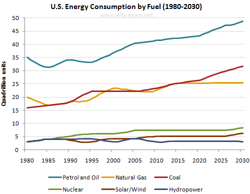
The graph below given information from a 2008 report about consumption of energy in the USA since 1980 with projections until 2030.

The line graph compares how Americans use six different energies from 1980 to 2030, a period of 50 year. This report was taken in 2008 and it is measured in quadrillion units.

It is noticeable that petrol and oil are the popular energies which beat the largest amount of consuming in the whole period, whereas nuclear and solar figures have a similar pattern. The following over period four energy resources incline slowly, while nature gas and hydropower remain reasonably stable.

In 1980, nuclear, solar and hydropower energies stood at the same figures which held at just under 5 quadrillion units, although petrol and oil energies reached the largest number of consuming in 35 quadrillion units. Moreover, petrol oil and natural gas followed the same graphic which was a gradual increase following 15 years at just under 40 and 25 quadrillion units. In any case, the hydropower energy recorded a steady decline at approximately 4 quadrillion units in 2000.

A closer look at the data reveals that petrol oil, coal, nuclear and solar powers have significantly risen since 2005 to 2013. Those figures will rise slightly onward, exceeding the consuming of hydropower and natural gas energies will level off between 2015 and 2030.

  • US_energy.png


SalMon 27 / 109  
Jun 23, 2014   #2
It is noticeable that petrol and oil are the popular energies which beat the largest amount of consumption in the whole period, whereas nuclear and solar figures have a similar pattern(what do you mean by this? whereas indicates the contrast, but similar indicates the same? Besides, I see that they don't have similar pattern?) . The following over period four energy resources incline slowly (what are the 4?) , while nature gas and hydropower remain reasonably stable.

(what do you mean by the following period? You have not mentioned any period previously so using following is somehow irrelevant)

Well I can see from your writings that you described the trend in groups of years. That's fine. But why don't you try describing in groups of trend. I mean, you can clearly see that it is divided into 3 different parts in the graph, petrol and oil, natural gas and coal, the 3 others. I think each group has its own trend so that it is easier to describe? What do you think?
OP tiaDS 73 / 222  
Jun 23, 2014   #3
the following period

I mean in the end of period.
I mentioned based on the year because

1980 with projections until 2030

History (1980-2008) and Projection (2009-2030), but it is fine if i write as per the figure of pattern.
MisterWandering 18 / 314  
Jun 25, 2014   #4
The line graph compares how Americans use six different energies from 1980 to 2030, a period of 50 year. This report was taken in 2008 and it is measured in quadrillion units.

The line graph compares energy consumption in the USA over a 50-year period.

the popular energies

the most popular sources of energy

which beat the largest amount of consuminginduring the whole period

The following over period

What do you mean by "the following period" in this graph?

although petrol and oil energies reached the largest number of consuming in 35 quadrillion units

which were around one-seventh of the corresponding figure for petrol and oil consumption

Moreover, petrol oil and natural gas followed the samea similargraphic trend

which was a gradual increase following 15 years at just under 40 and 25 quadrillion units

, both of which experienced a gradual increase throughout the next 15 years.

In any case

These words are not appropriate.

A closer look at the data reveals that

I don't think this phrase add any value to your sentence.
icebeating 3 / 5  
Jun 25, 2014   #5
I agree with Salmon, you should write the trend of the consumption instead.
eddies [Contributor] 25 / 1170  
Jun 26, 2014   #6
The line graph compares(I don't really agree if you use the verb 'compares'. This chart uses the appropriate language of change and compares the information)shows how Americans use six different energies during a 50-year period (a comma) from 1980 to 2030, (no comma here)This report was taken in 2008 and it is measured in quadrillion units.

t is noticeable that petrol and oil are the popular energies which beat the largest amount of consuming in the whole period, whereas nuclear and solar figures have a similar pattern. The following over period four energy resources incline slowly, while nature gas and hydropower remain reasonably stable.

If you put this as the overview, it will take time to read. Therefore, I suggest you to rewrite.
Have a look this one:It is clear that the consumption of energy has increased steadily. In any case, after slight increase, hydropower is predicted to decrease to the starting figure.


Home / Writing Feedback / [IELTS TASK 1] A report about consumption of energy in the USA
ⓘ Need Writing or Editing Help?
Fill out one of these forms for professional help:

Best Writing Service:
CustomPapers form ◳

Graduate Writing / Editing:
GraduateWriter form ◳

Excellence in Editing:
Rose Editing ◳

AI-Paper Rewriting:
Robot Rewrite ◳