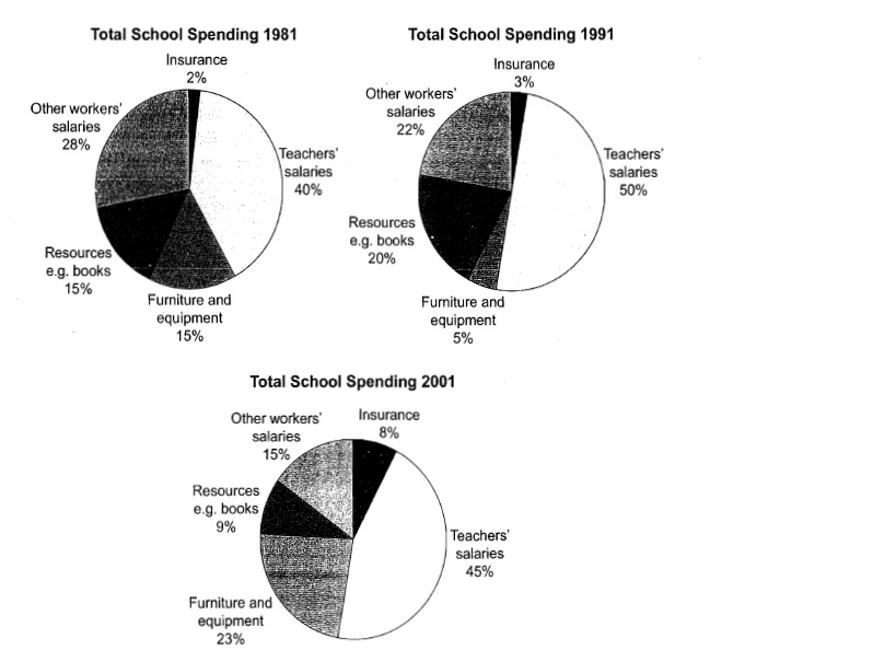
This three pie charts show the changes in annual spending by a particular UK school in 1981, 1991, and 2001. Summarise the information by selecting and reporting the main features, and make comparisons where relevant.
The pie charts illustrate the percentage of total school spending each year during three decades selected (1981, 1991, and 2001). Overall, the outlay of teachers' wages was the highest percentage throughout the year, whereas insurance was the lowest expenditure.
Spending proportion breaks the teachers' salaries as the highest one when it comes to almost a half of school outlay in the three years given. The second place was addressed to salaries of workers except teachers in the first two years, 28 percent and 22 percent respectively. However, spending for furniture and equipment in the following years overtook the previous second highest position.
Apart from previous comparison, expenditure for school resources saw a five-percent increase in 1991, yet in the next period school only spent 9 percent of budget to buy books. Interestingly, although insurance outlay was the lowest percentages all of period, there was a significant uptrend from year to year.
(151 words)

Pie Chart
