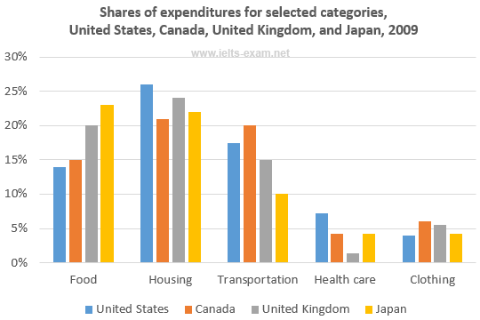
The bar chart below shows shares of expenditures for five major categories in the United States, Canada, the United Kingdom, and Japan in the year 2009.
The bar chart shows how people in the United States, Canada, the United Kingdom and Japan allocate different shares of amount spending to five basic need categories; food, housing, transportation, health care and clothing in 2009.
It is noticeable that Americans have the highest proportion of housing expenditure share, while Britons spend the lowest percentage of share spending on health care. However, the general figure can be seen that housing is the largest proportion of share expenditure component in all countries except Japan.
In Japan consumers paid out at just over 23 percent on food category and it was the largest percentage than food expenditure figure in the United Kingdom and Canada, between 20 % and approximately 15%. In any case, the percentage of food spending share in America was extremely lower than the total of American spending share on housing category which reached just over 25 per cent.
A closer look at the data reveals that Canadian spent much money for cost of transportation at around 20 percent of share expenditure, while Japanese recorded the lowest percentage on this category and it could be seen doubled amount of Canada's transportation figure. By contrast, the population of United Kingdom occupied the lowest percentage of health care sector, whereas the biggest percentage of clothes spending share was beaten by Canadian and Briton at around 5.5%.

share_expenditure.pn.png
