Unanswered [1] | Urgent [0]
  

Home / Writing Feedback   % width   Posts: 3


How much a specific United Kingdom school spent annually percentage-wise in three different years


kia3113 1 / -  
Nov 8, 2018   #1

School Spending


Answer:
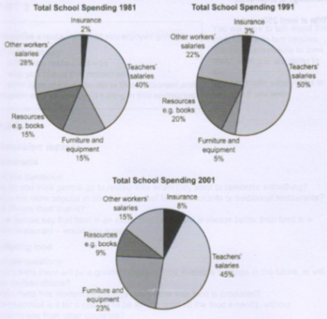
The three pie charts illustrate how different a specific United Kingdom school spent annually percentagewise in the years 1981,1991 and 2001.

Looking at the chart, it is clearly obvious that the income of teachers was the largest segment in school spending, while ensurance contributed the least to the school expenditure during that period.

Teacher's income, which registered the most - 40% of the UK school expenditure in 1981, rose dramatically to a half in 1991 and then had a slight decrease by 5% in 2001. In comparison, the insurance, which made the lowest contribution all over the course, went up minimally from 2% to 3% in 1991, before experienced a noticeable grow to 8% in 2001.

Other worker's income accounted for 28% of spending in 1981. Following this, worker's income fell during the 21-year course markedly to 22% in 1991 and significantly by 13% in 2001. Facilities and resources such as books expenditures were both initially at 15% in 1981. Then in 1991, facilities spending slumped rapidly by one tenth, but it made a more than fourfold increase of the proportion to 23% in 2001. In contrast, resources increased moderately by 10% after 10 years before experienced a significant drop to 9%.

  • Ielts writing task 1


D12345 1 / 4  
Nov 12, 2018   #2
My suggestions in your introduction : ... illustrate an annual expenditure in certain UK's school between 1981 and 2001

"before experienced (Experiencing) a noticeable growth"

Obviously, The school spent a large proportion in teacher's salary while spending in insurance showed the reverse.
I think you should try to compare one figures to another like " figures a spent two fold of B expenditure"
Holt  Educational Consultant - / 15385  
Nov 12, 2018   #3
Kim, this is one of the better analyzed pie charts that I have seen presented at this forum. Your summary overview, where most students leave out information is, I am happy to say, complete and so is the rest of the essay based on summary requirements all the way to the trending statement. Good job!

With regards to your sentence structure though, paragraph 3 is composed of run-on sentences. Try to present each bit of information as a separate sentence instead of an additional analysis presentation in one sentence. That way you create more complex sentences and keep the focus of the paragraph on easy to follow information presentations. Remember, the assumption is that the reader does not have access to the chart so the clearer you can make your information presentation per sentence, per paragraph, the better for your score.

Another piece of advice, since the essay is using actual percentage measurements, please refrain from using estimated references such as "to a half" because such statements tend to confuse the reader who, as I said, hasn't seen the pie chart. So no guesswork please. Just pure and accurate data presentation from the pie chart. Remember, you are being scored on coherence and cohesiveness, which is based on the accuracy of the data presented.


Home / Writing Feedback / How much a specific United Kingdom school spent annually percentage-wise in three different years
Do You Need
Academic Writing
or Editing Help?
Fill out one of these forms:

Graduate Writing / Editing:
GraduateWriter form ◳

Best Essay Service:
CustomPapers form ◳

Excellence in Editing:
Rose Editing ◳

AI-Paper Rewriting:
Robot Rewrite ◳

Academic AI Writer:
Custom AI Writer ◳