The table and pie chart analysis
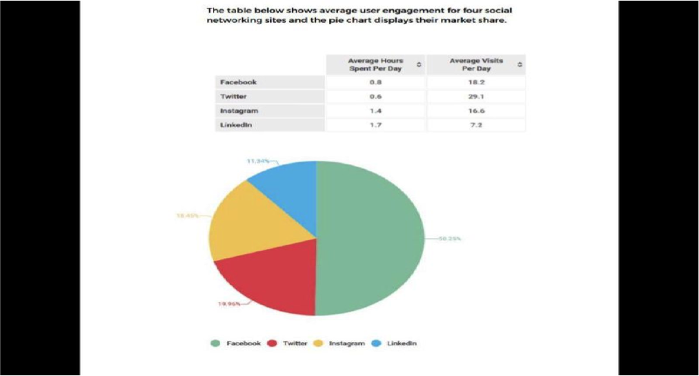
The table reveals about the number of people prefer to spent their time and visit to four different social media per day, while the pie chart shows the segment of the market from those social networking site companies.
Overall, if it is compared to the table summarize in Instagram and Linkedin, also the profits from those companies, the percentage of people using Facebook and twitter in hours per day has by far the lowest, however, they show a significant proportion of people who visiting them per day and the considerable amount of companies' profits.
To begin with, although, Facebook and Twitter are noticed as the least social media using by people in hours per day, gaining 0,8 and 0,6 in subsequent, both of those networking sites are the most frequent platform that are visited by people per day at around 18,2 and 29,1 where Twitter can be recognized as the highest. Also, those social platform companies earn more substantial revenue than others, where Facebook receives income to around 50,25 % more than Twitter only about 19,96 %.
Whilst, the start-up social media companies, known as Instagram and Linkedin, gaining more people's interest in spending their time per day to around 1,4 and 1,7 subsequently. In contrast, If it is compared to the figure compiled from Facebook and Twitter, the average people visiting these platforms per day indicates less percentage, where Instagram is gaining bigger percentage with 16,6 than Linkedin with only 7,2. These results are more likely affected to the companies' profits performance, it can be seen from the pie chart that Instagram and Linkedin Companies receive only 18,45 % and 11,34 % in subsequent less than Facebook and Twitter.

Unbenannt.png
Unbenannt.png
