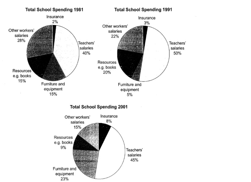
The three pie charts below show the changes in annual spending by a particular UK school in 1981,1991 and 2001.
The three pie charts present the trend of annual expenditure in an UK school in 1981,1991,2001. At first glance, teachers' salaries remained the largest percentage of the total expenditure.
The teacher's salaries were fluctuated across the period. It started from 40% in 1981, followed by 50 % in 1991 and reduced to 45% in 2001. Resources such as books experienced a similar pattern. In 1981, it occupied 15% of the spending and it rose to one fifth in 1991 before dropping to 9% in 2001.
Other workers' salaries had been decreasing over last three decades, which reduced from 288% in 1981 to only 15% in 2001. On the other hand, more money had spent on insurance. It first rose by 1% to 3 % in 1991 and then dramatically climbed to 8% in 2001. Furniture and equipment also increased from 15% in 1981 to 23% in 2001, despite the fact that it declined by 10% in 1991.
Overall, teachers and other workers' salaries, furniture and equipment were the highest expenses of the school for the last 30 years.

Untitled.jpg
