analysis of the pie charts - Ielts task
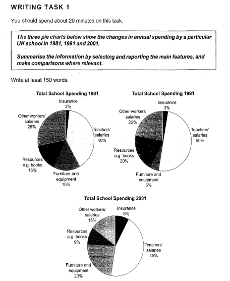
The pie charts described the percentage of school spending in the United Kingdom during 3 separate decades: 1981, 1991, and 2001. Teacher's salaries dominate expenditure of schools spending and Insurance always be a small part of every decade.
Percentage of teacher's salaries increased to a half of total spending in 1991 and has descended to 45% in 2001. Furniture and equipment fell dramatically from 15% to 5% and rose extremely in the amount of 18% for next ten years. Resources spent 15% of total budget, became to one-fifth on UK school budget in 1991, and descended just to 9% in 2001. Other workers' salaries continue to decline from 28% to 22% or almost one-fifth part of total expenditures, and the last became 15%. In contrast to other workers'salaries, insurance has increased every decade, although it is not very significant. It began from 2%, rose 1%, and became 8% or almost one-tenth in 2001.

02_writing_ielts_07.png
