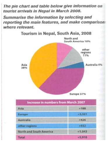
The pie chart and table below give information on tourist arrivals in Nepal in March 2008.The chart reveals the number of foreigners from different regions who visit Nepal in March 2008 and is measured in percentage, and the table measures the increasing number from March 2007. Overall, it is noticeable that the number of tourists in several regions increased over a year. However, the Europeans were the most popular tourists coming to Nepal.
Turning to 2008, Asian (38 per cent) and European (37 per cent) experienced as higher number of tourists than the other regions when it came to visiting Nepal. On the other hand, the lowest point of visitors was Australian, which was solely less than one in twenty. Afterwards, at 21 per cent, North and South America and other regions showed as the remaining visitors to Nepal.
In addition, the total number of visitors from all regions from March 2007 to 2008 expanded to 5,910, which was 16 per cent. While the number of tourists from Europe saw as the highest point at 3,321, Asian experienced as the lowest point at merely 188.

pie_chart_nepal.jp.jpg
Hi, aseprudi. Here are my suggested changes to your word choice. My suggested changes are inblueand explanations for why I'm suggesting the changes are inred.
The pie(it's a good idea to use this modifier to separate the pie chart from the table, just in case someone gets confused) chart revealsprovides(I think this is a more appropriate verb to use to describe what the chart is showing)a percentage breakdown of the nationalities of Nepal's visitors in March 2008.(this is a quicker way to say what you are trying to say) the number of foreigners from different regions who visit Nepal in March 2008 and is measured in percentage, and The table depicts(again, a better verb for this situation)measureshow many more visitors came to Nepal from each country in March 2008 thanthe increasing number from March 2007.
(This starts a new idea, so I'm going to use it to start a new paragraph)Overall,it is noticeable that The number of tourists from all countriesin several regions increased by 5,910 over the sampleda year. New European visitors accounted for the largest portion of this increase; Nepal's European tourist count increased by 3,321 between March 2007 to March 2008.(This is a faster, smoother way to express your ideas)In addition, the total number of visitors from all regions from March 2007 to 2008 expanded to 5,910, which was 16 per cent. While the number of tourists from Europe saw as the highest point at 3,321,The number of Asian touristsexperienced as the lowest point atincreased the least during the sampled year, up by merely 188.(this sentence belongs in this paragraph). .
However, the Europeans were the most popular tourists coming to Nepal.This is already stated in the following paragraph)
I think you should consider putting this paragraph before the one about the chart since this focuses on just one year, while the chart compares two years. Also, you should be consistent in the order in which you describe and explain each graphic)Turning toIn March 2008, Asians(38 per cent) and Europeans(37 per cent)accounted for the majority of Nepal's tourists (38% and 37% respectively).experienced as higher number of tourists than the other regions when it came to visiting Nepal.On the other hand,thelowest point ofvisitors was Australiansaccounted for the fewest of Nepal's March 2008 tourists (4%) , which was solely less than one in twenty. North Americans, South Americans, and visitors from other countries accounted for the rest of Nepal's March 2008 tourists (Afterwards, at 21%)per cent, North and South America and other regions showed as the remaining visitors to Nepal . (These suggestions are to show you clearer ways to express your thoughts)
Most of the changes I'm making are to help you express your thoughts more clearly and succinctly. These exercises are really tough, so take heart. I think you did great analyzing the information.
Hi, @aseprudi
do not forget to attach image
The chart reveals information with regard to the number of foreigners from different regions who visit Nepal in March 2008 and it is measured in percentage, and the table measures the increasing number in March 2007.

