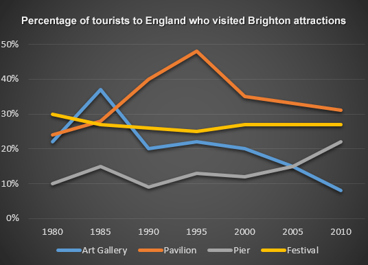
The line graph below shows the percentage of tourists to England who visited four different attractions in Brighton.
Summarise the information by selecting and reporting the main features, and make comparisons where relevant.
The line graph illustrates the quantity measured in percentage of tourists who chose four attractions to visit which are Art Gallery, Pavilion, Pier, Festival. Overall, the graph betokens that Pavilion is the most visited tourist attraction.
When it comes Pier, from the period from 1980 to 2000, it remains almost constant at 10 percentage with slight fluctuation up and down, but after that to 2010, it remarkably went upward to more than 20%.
The Art Gallery has almost the opposite story, in 1980, it started off at approximately 20* and it erected to roughly 38% in 1985. Unfortunately, after that, it fell down to almost 9% in 2010, with slight increase in 1995.
Festival has the most stable curve in the graph, it almost stays at approximately 28% for the whole 30 years, with a slight decrease from 1985 to 2000.
Pavilion, it began at 23% in 1980. There was a significant increase in percentage after that, in 1995, it managed to reach almost 50 %, but it could not maintain its for long. The period from 1995 to 2010. Pavilion continuously reduce its percentage to roughly 30% in 2010.

IELTS_Writing_Task_1.png
