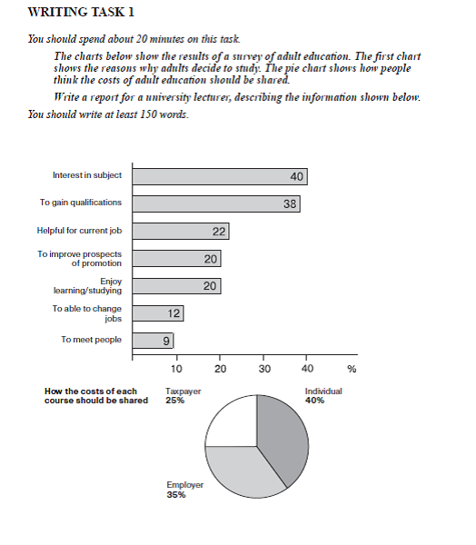
The two of the charts below present publishing a survey youngster education with the first chart examine the percentage of the reason why they are more likely to continue study, and the pie illustrates people opinion about how costs sharing on education should be one priority. Overall, it can be seen that interest in subject and gain qualifications had the highest percentage, and that individual opinion showed the most percentage should be shared.
The first, the proportion of interest in subject was much greater than the other reasons. 40 percent of students interest in subject compared to 38 percent of gain qualifications, both of these reasons had the largest number than others. However, to improve prospects of promotion remained stable the same level as enjoy learning/studying for adult's reason to study about 20 percent, helpful for current job's reason witnessed a steady growth only 0.2 percent over both two reasons. In contrast, youngster that chose to able to change jobs had a smaller 12 percent than to meet people only 9 percent.
On the other hand, 40 percent of individual are believed that the costs of each course should be shared while taxpayer experienced the smallest percentage from the three parts of people about 25 percent. Moreover, the percentage of employer had the second larger proportion just about 35 percent.

Chart_1_Cambridge_1.png
