Australian Household Energy Use
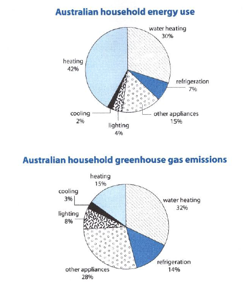
The first chart below shows how energy is used in an average Australian household. The second chart shows the greenhouse gas emission which result from this energy use.
Summarize the information by selecting and reporting the main features, and make comparisons where relevant.
The pie charts give information about the proportion of energy used by Australian houses in six distinct categories and the relative amount of greenhouse gas emitted from each category.
Overall, most of the energy is utilized for heating purposes, which together accounts for more than half of total energy use, while cooling spends the least amount of energy. Similar to the energy use, heating processes are the biggest contributor of greenhouse gas.
From the first pie chart, heating and water heating is by far the most important means of energy use, with 42% and 30% respectively. Cooling purposes, such as cooling and refrigeration, uses only tiny amount of energy, less than 10% collectively. A similar figure also used for lamps. Other appliances accounts for 15% of total energy use.
However, the second pie chart shows different figures for greenhouse gas emitted by each sectors. Heating processes still serve at first place with 47% greenhouse gas, but water heating contributes more with the figure of 32%. Other appliances emits 28% of the gas, which is significantly lower than the use proportion. Refrigeration and lighting also showed higher figure compared to the utilization. On the other hand, cooling process only contributes for a negligible amount of greenhouse gas.
(206 words)
I look forward for your corrections and suggestions. Thanks in advance ^^

1011.png
