Unanswered [2] | Urgent [0]
  

Posts by yus72
Name: Yustinus Hari Setiawan
Joined: Jan 18, 2016
Last Post: Jan 21, 2016
Threads: 6
Posts: 6  
Likes: 1
From: indonesia
School: Jember University

Displayed posts: 12
sort: Latest first   Oldest first  | 
yus72   
Jan 21, 2016
Writing Feedback / Female Unemployment Rates In Each Country Of The United Kingdom in 2013 and 2014 [2]

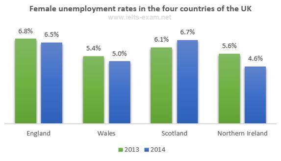
The graph below shows female unemployment rates in each country of the United Kingdom in 2013 and 2014.

A description of the proportion of the female jobless rates in each country of the United Kingdom during 2013 to 2014 is illustrated in bar chart. Overall, it is important to notice, the figures was fluctuation over the period. How ever the number of female jobless in Northern Ireland reached to peak at 6,8% in 2013.

Moving to more detail analyze, to begin to 2013, the proportion of female unemployment in England stood at 6,8 % and it was highest that compared the other country. On the other hand, Scotland had the proportion of women jobless at 6,7% in 2014. And also became the highest of woman jobless in this period. But it was still lower than England.

On the other hand, the country had lowest proportion of female unemployment rate was wales at 5,4% in 2013 and had The percentage of female jobless at 5% in 2014.


yus72   
Jan 21, 2016
Writing Feedback / The percentage of unemployment rates among women in several countries of the United Kingdom [3]

@Fauzi17 let me give feed back to your essay

A breakdown of the percentage of unemployment ratesrate among women in several ...
Overall, it is important to note that decreased female unemployment decreased in the rate, except in Scotland. The highest number was released by Scottish ...

However, therethe figure decreased by 0.3% in 2014.

Afterwards, therethis figure increased to 6.7% women in 2014.
yus72   
Jan 21, 2016
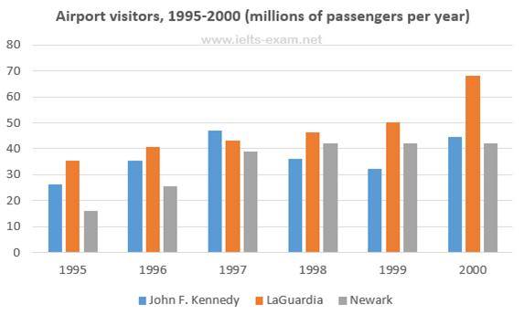
Writing Feedback / The number of travellers visited New York City through three main US airports [3]

@Fauzi17 let me give you some feedback

... and is measured by million is illustrated in bar chart .
... saw upwards trend, [coma delete]whenand LaGuardia airport was the most ...
Next, there was a fluctuantedfluctuation pattern in the number of passengers ...

... stood at 35m in 1995, after that, therethis figurerose gradually for ...
... LaGuardia airport reached the peak point at around68m travellers.

In the last two years [coma] it remained stable at 42m travellers.

... reach the highest point of 47m in 1997. In 1999Following this , the figure for passengers was a minimal decrease to 32m in 1999.
yus72   
Jan 21, 2016
Writing Feedback / A description of the number of visitor utilizing three main airports in New York City [2]

The chart below shows the number of travellers using three major airports in New York City between 1995 and 2000.

A description of the number of visitor utilizing three main airports in New York City during the period 1995 to 2000 calculated by million passengers is illustrated in bar chart. Overall, It is important to notice, that LaGuardia airport become a favorite airport than others. How ever, John F. Kennedy airport is the only one airport which decreasing smoothly during 1998 to 1999.

Moving to more detail analyze, In 2000 , All of airport in New York City were higher traveller than the others years period. How ever the visitor using LaGuardia Airport had traveller at less than 70 millions passengers in 2000 and It was highest that Compared in all years period and others airport.

In 1995, All of the airport in New york City had less passengers then other years. And then, The number of Visitor in all Airport increased smoothly during 1995 to 1998 How Ever, LaGuardia airport had highest visitor at approximately 35, and Newark had lowest Passengers at about 15 Billions Passenger.


yus72   
Jan 21, 2016
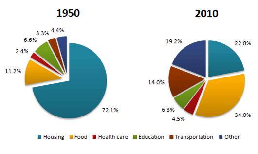
Writing Feedback / The average household expenditures in a country in 1950 and 2010 [2]

The pie charts below show the average household expenditures in a country in 1950 and 2010

A description of the proportion of the family expense in region over 12 month in period 1950 and from 2010 is illustrated in pie chart. Overall, it is important to notice, that housing cost in1950 was the highest expenditures that was compared the others in all period. On the other hand, health care expense was still lowest in all of this period.

Moving to more detail analyze, in 1950, The top rank of average national family expenditure was housing at 72% and fell significant at 22% in 2010. The second rank of the average family expense was food at 11,2% but Increased dramatically at 34% in 2010, and became the highest expenditure household in the over year period in 2010. In the other Hand, The proportion of others national consumption increased sharply at 19.2% was higher than 1950 at 4,4%.

Next to others analysis, in 1950, the proportion of health care, and education expense become the lower than the other household expenditure. The position of the figures was still same in 2010. However, The percentage of the average household expenditure at 4,5% was lower than Proportion of the Education expense at 6,3%, and was lowest proportion of household expenditure in all period.


yus72   
Jan 20, 2016
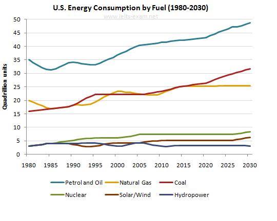
Writing Feedback / Annual Energy Outlook 2008 Consumption of Energy in the US [2]

The graph below gives information from Annual Energy Outlook 2008 about consumption of energy in the US since 1980 with projection until 2030

the energy consumption


The line Chart bellow illustrates the information about the consumption of energy in the USA between 1980 and with projection 2030 based on Annual energy outlook and is measured by quadrillion units. Overall, it is important to notice that energy consumption from Petrol and oil still dominant which is compared with the others in over the frame period. In other hand, the figure of hydropower energy consumed still remains stable.

Moving to a more detail analyze in non-renewable energy category such as Petrol oil, Natural gas, and coal, to begin, in 1980 the number of consumption energy from petrol and oil stood at 35 quadrillion, this was the highest compared Natural gas at 20 quadrillion units and coal at approximately at 16 quadrillion units. Even though almost the energy consumption in sector non-renewable energy had time to decline steadily in 1985. After that, the general trend figures of the energy consumption from non-renewable energy have been increasing significant until 2030. The peak consumption will reach in 2030 where petrol and oil will stand at less than 50 quadrillion units, coal at approximately 27 quadrillion units, and natural gas at about 25 quadrillion units. However, the amount of energy consumption from Petrol and Gas will be highest compared with others.

Turning to renewable energy, all of the figures showed the energy consumption stood at less then 5 quadrillion units in 1980. Next the number of energy consumption from solar and hydropower have been fluctuating smoothly and those will estimate for reaching on the top consumption in 2030 which the amount of energy consumption from solar at about 6 quadrillion units and hydropower at about 3 quadrillion units. How ever, the energy consumption from nuclear will reach at approximately 9 quadrillion units in 2030. This will be highest in renewable category


yus72   
Jan 20, 2016
Writing Feedback / Consumption of energy in the USA in the Past and Future [2]

Hi bunglon, where are you? I appreciate with your writing, I just give you little correction about your tenses in your paraphrase :

At first glance, there ishas been a significant difference in (...) for energy consumption in U.SUS . while Petrol and Oil usage ...
yus72   
Jan 20, 2016
Writing Feedback / The Rate of U.S. Consumption of Energy Since 1980 with Projection until 2030 [2]

Hi Febri, I just give you a few correction. Regards.

... 2008 shows the rate of U.S. US ...
... three energy sources either, in historical ...

... which stood at 35 quadrillion units , while the second largest (...) 20 quadrillion units .

..., there ishave been a different trend.
yus72   
Jan 19, 2016
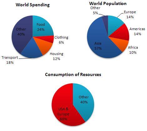
Writing Feedback / Proportion of World Expense, Amount of The world Population and Utilisation of Sources [3]

The pie charts below show World Spending, World population and Consumption of Resources.

The bar charts bellow illustrate proportion of world expense, amount of world population and utilisation of sources in the four countinent and are calculated by percentage. Overall, it is important to notice, The percentage of asia people is the highest compared the others. On the other hand, the people who live in USA & Europe show dominant in consumtion of sources.

Move to detail, with total population at 28%, people in America and europe utilize resouces at 60% higher than people live in the other continent containt of asia, africa, and the other continent at 72% but consume source just 40%. It mean in america and europe double of twist compared with total in habitan in asia, africa, and the other continent.

Turning to world spending, eventhough food have percentage at 24% but it is till lower campared other expenditure taht have at 40%. Whilst transpot expenditure is in the third position wit percentage at 18%. The lowest world spending is cloting with at 60% .


yus72   
Jan 19, 2016
Writing Feedback / The number of students interested in lesson [5]

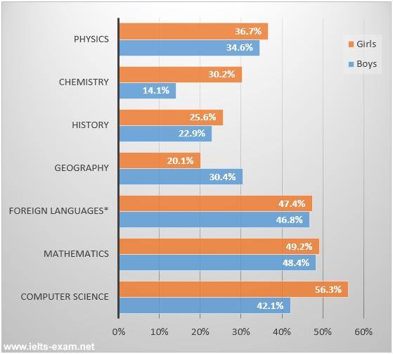
... was at 56.3% and just at 42.1% comecame from boys in the similar lesson.
... in mathematics and followed by at 48.4% of the gentlemen.
yus72   
Jan 18, 2016
Writing Feedback / The level of graduation student passed the examination in senior high school [2]

The bar chart below shows the percentage of students who passed their high school competency exams, by subject and gender, during the period 2010-2011.

The bar chart illustrates about the level of graduation student passéd the examination in senior high school during 2010 - 2011 and is measured by subject and gender. Overall, it is important to notice, the percentage of the girls passed competency exam in computer science was dominant then others subject and gender. Despite the level of boys student graduated capability test in mathematic was highest in same category.

Base on the figure, the three subject had total percentage rate above at 75% were foreign languages, mathematics, and computer science. But, with total percentage at 98,4% result from boys and student contribution who passed competency examination, computer science was dominant than mathematic and foreign languages, and there was in the ranking. The second ranking was mathematic with point at 97,6%. And third was foreign languages with value

94,2%.

Turning to the other subject had category of total rate below at 75% were physics , chemistry, history and geography. With total 71,3% Physics become a subject then other base on this category. The lowest subject that the student both girls and boys passed the competency examination was chemistry with total point at 44,3%.


Writing
Editing Help?
Fill in one of the forms below to get professional help with your assignments:

Graduate Writing / Editing:
GraduateWriter form ◳

Best Essay Service:
CustomPapers form ◳

Excellence in Editing:
Rose Editing ◳

AI-Paper Rewriting:
Robot Rewrite ◳