Hi all,
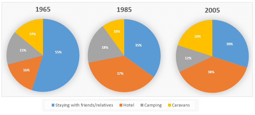
Please feel free to comment my writing for this prompt: The charts show the proportion of holidaymakers of one region staying in different types of accommodation in three different years. Summarize the information by selecting and reporting the main features, and make comparisons where relevant.
The pie charts compare four different places of accomodation where travelers from one area stayed in the years 1965, 1985 and 2005. Overall, the majority of holidaymakers preferred staying with friends or relatives or living in hotels to spending night time in camps or caravans. It is also noticeable that every option out of four had a specific trend over the period shown.
In 1965, staying with friends or relatives accounted for the highest proportion and 55% of all travelers chose this option but the percentage fell to 35% and 30% in 1985 and 2005, respectively. By contrast, only 16% of holidaymakers preferred living in hotels to other choices in 1965 and the figure for this group increased to 37% and reached a peak of 38% to become the most popular choice in the next four decades mentioned.
Unlike the above two options, the figure for camping and caravans changed inversely during the 40-year period. The figure for camping grew by 3% in the first twenty years but declined twofold in the final period while the figure for caravan parks dropped by 4% and then doubled in 2005.
Thank you in advance.
Please feel free to comment my writing for this prompt: The charts show the proportion of holidaymakers of one region staying in different types of accommodation in three different years. Summarize the information by selecting and reporting the main features, and make comparisons where relevant.
proportion of different accommodations types
The pie charts compare four different places of accomodation where travelers from one area stayed in the years 1965, 1985 and 2005. Overall, the majority of holidaymakers preferred staying with friends or relatives or living in hotels to spending night time in camps or caravans. It is also noticeable that every option out of four had a specific trend over the period shown.
In 1965, staying with friends or relatives accounted for the highest proportion and 55% of all travelers chose this option but the percentage fell to 35% and 30% in 1985 and 2005, respectively. By contrast, only 16% of holidaymakers preferred living in hotels to other choices in 1965 and the figure for this group increased to 37% and reached a peak of 38% to become the most popular choice in the next four decades mentioned.
Unlike the above two options, the figure for camping and caravans changed inversely during the 40-year period. The figure for camping grew by 3% in the first twenty years but declined twofold in the final period while the figure for caravan parks dropped by 4% and then doubled in 2005.
Thank you in advance.

ieltsgraph256type.png
