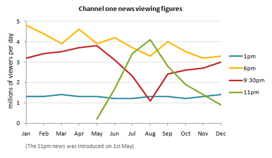
A breakdown of the information about the number of viewers per day measured by millions for Channel One News over a 12-month period in four part times is revealed in a line chart. Overall, all of the figures showed different trend. The most popular channel news was watched in 9.30pm.
It can be seen that, the 6pm and 1pm news experienced as the favourite and the most unpopular channel news. To begin with, just under 5 million viewers in January, then the 6pm news fell gradually almost over 3 million in the last two years. Meanwhile, the 1pm news witnessed a steady increase until the end of period.
The two channel news that showed a dramatic change of gazer's number over a 12-month period. The 9.30pm news stood at just above 3 million visitors, and then it dipped to almost 1 millions in August, and in the last four months increased markedly to the same point which it started. There was a sharp rise in the number of 11pm news viewers, when it was introduced on 1st may, but after hit a high point approximately 4 million, it showed a gradual rise until the end of period solely at fewer than 1 million viewers.

The average daily figures for Channel One News over a 12-month period
