Crime statistics
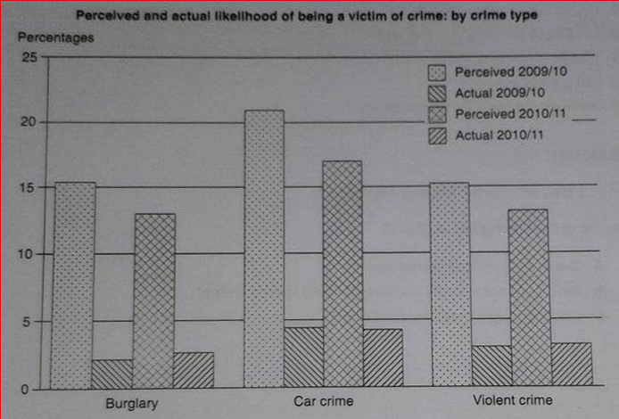
The graph below shows the perceived danger and actual likelihood of being a victim of crime.
===================================================================
Hello. This is my practice for IELTS writing task 1. Thanks in advance for your feedback :)
===================================================================
The bar chart compares the projected and actual criminal incidents in 2009 and 2018. The data is measured in percent and covers 3 types of crimes which are burglary, car crime, and violent crime. It is noticeable that all of them crimes were overestimated and the most common case was car crime in both years.
The gaps between predicted and actual cases of all categories were immense, either in 2009 or in 2010. All of the three types had much greater envisaged percentage, but the hugest among them was experienced by car crime. This criminal act witnessed more than 20% gap in 2009 and about 5% lower in the next year. Meanwhile, the other two types only experienced more or less a tenth gaps.
A closer look at the date shows that car crime cases stood out as the most frequent criminal action estimated and happened. Although its prediction which was previously projected to be 20% fell by roughly 5% in 2010, the real case proportion remained the same. The prediction for burglary and violent crime also saw similar percentages and trends, both smaller in 2010. In reality, violence happened more often than burglary, however.

39509.jpg
