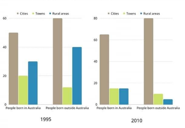
The bar chart below describes some changes about the percentage of people were born in Australia and who were born outside Australia living in urban, rural and town between 1995 and 2010.
Summarise the information by selecting and reporting the main features and make comparisons where relevant.
The graph demonstrates the proportion of people born in Australia and who were born outside Australia living in different places namely cities, countryside, and towns over a 5-year period, starting in 1995.
Overall, the bar chart witnessed several changes after 5 years. It is also clear that the number of citizens who were born outside Australia and live in cities remained at the highest rate throughout the given course.
In 1995, the rate of people who were born in Australia living in cities stood at around 50% and grew slightly to over 60% in 2010, while the figure for people who were born outside Australia was considerably higher than it, with 60% initially and rose drastically by 20%, reaching 80% in the 5 following years
Regarding the percentage of citizens who were born in Australia and lived in towns and rural started out at approximately 20% and 35% respectively, after which suffered a dramatic drop and recorded having the same figure, nearly 18%. Similar patterns were also seen in the rates of people who were born outside Australia in towns and rural areas, with 18% for the former and 40% for the latter, both recorded in 1995. Then, those figures reduced sharply to under 15% and 10% respectively at the end of the period.
Thanks for your help

task1_5.png
