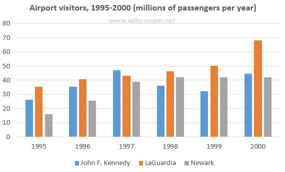
The number of travellers using three major airports in New York City between 1995 and 2000
The bar chart illustrates the figure for tourists travelling through three major airports in New York City (John F. Kennedy, LaGuardia, Newark) and measured in millions from 1995 to 2000. Overall, it can be seen that the passengers of LaGuardia airport experienced a gradual increase over a six-year period.
To begin, in 1995, the number of passengers for LaGuardia airport stood at just above 35. The following years witnessed a steadily rise to 50, almost a 15-rise over five years. Afterwards, it reached the peak at roughly 70 in 2000. Surprisingly, the figure for LaGuardia also predominated of passengers throughout the period.
There was a steady rise in the number of tourists going on by using John F. Kennedy airport between 1995 and 1997, from just over 20 to approximately 50. However, it decreased for the following three years and saw recovery in 2000. While, Newark showed a significant incline from 15 to almost 40 during three years and then it levelled off in 1998 onwards.

13226754_10204576010.jpg
