Unanswered [1] | Urgent [0]
  

Home / Writing Feedback   % width   Posts: 2


The bar chart reveals the change of the proportion of USA citizens (all ages) living alone


nhatlamielts 1 / -  
Sep 11, 2018   #1

Essay for ielts writing task 1


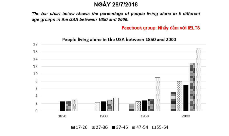
A glance at the bar chart provided reveals the change of the proportion of USA citizens living alone in terms of various age groups over one and a half century from 1850.

Looking at the graph, It is immediately obvious that more and more people in more age groups decided to live alone, especially the 55-64 age group.

According to the chart, in 1850, the percentage of alone people was not considerable and majority in three age groups, which were the 37-46, 47-54 and 55-64 age group. However, 5 decades later, there appeared add an new age group living alone, which was the 27-36, account for over 2%. Meanwhile, others showed a slightly upward trend, exception the 37-46 age group remained stable.

As can be seen from the graph, from 1950, there were 5 main age groups living alone. During 50 years later, the percentage of alone people dramatically increase. The 55-64 age groups was still made up the highest proportion, while people from 27-36 years old took over the 37-46 age group.

  • ielts_writing_task_1.png


Holt  Educational Consultant - / 15385  
Sep 12, 2018   #2
Ngo, while you did write 180 plus words in this essay, the analysis and presentation of facts for your essay is insufficient and, in some instances incorrect. While you did present the correct illustration identification, you did not complete the prompt overview and trending statement in the correct manner. You also did not sufficiently explain the data per group from the chart. The prompt overview should have been as follows:

The bar chart provided for analysis and reporting in this essay represents trend of Americans living alone based on 5 different age groups. The measurement was done in percentages and covered the following age groups regardless of gender considerations: 17-26, 27-36, 47-54, 55-64. The trend indicated is that Americans preferred to live alone on an increasing basis starting from the year 1850 and peaked in 2000. The measurements were observed starting from 1850 and were charted based on a per decade reading until the year 2000.

Now, since the data indicated in the graph was presented on a per decade year basis, each decade of comparison needs to be clearly indicated in the essay. The essay becomes factually inaccurate when you do not inform the reader of the actual data presented that you used for the development of the report. Remember, the assumption is that the reader does not have access to the image so you need to be highly specific about the information you received and analyzed. Doing so will ensure a better Task 1 score even if your grammar is not as perfect as it can be.


Home / Writing Feedback / The bar chart reveals the change of the proportion of USA citizens (all ages) living alone
Need Writing or Editing Help?
Fill out one of these forms:

Graduate Writing / Editing:
GraduateWriter form ◳

Best Essay Service:
CustomPapers form ◳

Excellence in Editing:
Rose Editing ◳

AI-Paper Rewriting:
Robot Rewrite ◳

Academic AI Writer:
Custom AI Writer ◳