How kids commute to schools
TOPIC:
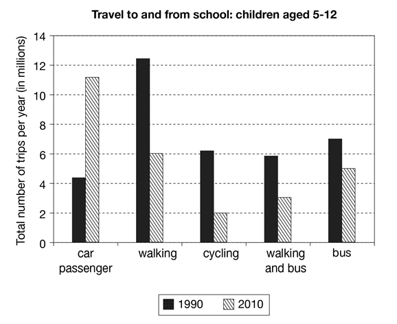
The chart below shows the number of trips made by children in one country in 1990 and 2010 to travel to and from school using different modes of transport. Summarise the information by selecting and reporting the main features, and make comparisons where relevant.
MY ESSAY:
The bar chart demonstrates the number of trips taken by children between the age of 5 to 12 in one country in 1990 and 2010 respectively. It also shows the transportation modes that children take when travel from and to school.
In 1990, the majority of children go to school and back home by walking. It has more than 12 million and nearly a double of all the other transportation modes. Car passenger, cycling, walking and bus, and bus are relatively less popular. None of these modes has more than 8 million.
The phenomenon was very different in the year of 2010. Car passenger has sky rocketed from around 4 million to more than 11 million. In contrast, walking, cycling, walking and bus, and bus decreased significantly. It is worthy to notice that the number of children who go to and from school by walking and cycling dropped by more than half.
In general, it can be observed that the pattern transportation mode has undergone significant changes, with car passenger has become more popular.
---------------------------------------------
please help me to mark my essay and give me some feedback with a band score.
thanks!!!!

bar chart
