total world population - analysis of the chart
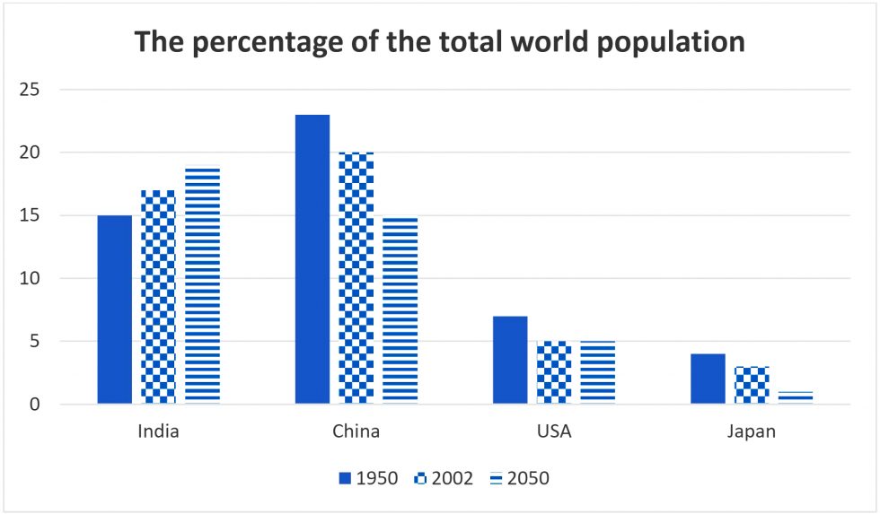
The given bar graph provides information regarding the proportion of the people in the world in India, China, USA and Japan from 1950 to 2003 and predictions for 2050.
Overall, China and India accounted for a large proportion of the demographics in the world and is forecast to remain their first places. However, the numbers of people in the USA and Japan were not nearly as high as in China and India.
As a closer look at the graph, there is a contrasting trend between China and India. In 1950, the percentage of Indian people was 15%, then this country witnessed a moderate increase in 2002 and is projected to have reach a peak of approximately 18% by 2050. While, China peaked at around 23% and dropped considerably in 2002 and is predicted to follow the same pattern and fall to 15% in 2050.
According the the graph, the number of citizens in the USA in 1950 was relatively higher than in Japan, at approximately 8% and 4% respectively. In the USA, there was a slight drop of 3% in 2002 and it is expected to remain the same in 2050. In the meanwhile, the proportion of Japanese people fell slightly in 2002 and has a tendency to continue to take a plunge to around 2% in 2050.

1207.jpg
