Unanswered [1] | Urgent [0]
  

Home / Writing Feedback   % width   Posts: 2


The bar chart shows the yearly visitors of National Gallery, Victoria and Albert Museum


Kikiki 4 / 4  
Apr 27, 2015   #1
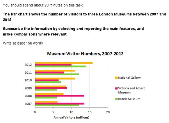
This bar chart shows the yearly visitors of National Gallery, Victoria and Albert Museum, British Gallery over 2007 to 2012. Generally speaking, the peak of visitor was at 2012, reaching at 40 million peoples. In contrast, the fewest number of visitors was at 2009 and 2010, both of which accounted for around 23 million.

It was immediately apparent that the most popular museum from 2007 until 2009 was Victoria and Albert Museum. However, the visitors were decreased significantly from 2008 and reached its lowest point at 2010. After that, it gradually rose by around 4 million visitors within 2 years. The most notable development of visitor was at National Gallery which had a rise of 10 million visitors for over 6 years period to 16 million visitors, which had became the most visited museum at 2012. In stark contrast, British Museum had an upward trend of visitors after 2009, while on 2007 dropped significantly by around 50%, and remained steady on the bottom line for the next 2 years.

  • Capture.JPG


SalMon 27 / 109  
Apr 28, 2015   #2
Hi Kikiki! Here are some mistakes that you should take notice of:

This bar chart shows the yearly visitors of National Gallery, Victoria and Albert Museum, British Gallery overfrom 2007 to 2012. Generally speaking( well you should use overall or it can be seen from the graph that...) , the peak of visitor was atin 2012, reaching at(reach + number) 40 million peoplespeople . In contrast, the fewest(please use lowest) number of visitors was atin 2009 and 2010, both of which accounted for around 23 million.

You should remember that when you write a summary in the opening, please don't cite numbers here. Just generalize the overall trend and sometimes subtrend.

It was immediately apparent(how could it be immediate? Apparent just shows it all) that the most popular museum from 2007 until 2009 was Victoria and Albert Museum. However, the visitors were decreaseddecreased significantly from 2008 and reached its lowest point atin 2010. After that, it gradually rose by(just use rise up to ) around 4 million visitors within 2 years. The most notable development of visitor was at National Gallery which had a rise of 10 million visitors forin over 6 years period (if you want to use this, fix to: 6-year period) to 16 million visitors, which had became the most visited museum atin 2012. In stark contrast, British Museum had an upward trend of visitors after 2009, while on 2007 dropped significantly by around 50%, and remained steady on the bottom line for the next 2 years.

In stark contrast, British Museum had an upward trend of visitors after 2009, while on 2007 dropped significantly by around 50%, and remained steady on the bottom line for the next 2 years.

~> please note that this is not in stark contrast. Because you are not speaking of this museum at the same time as National Gallery. and I think you should write it according to the timeline, not backward as you did in your paragraph, which might cause confusion for readers. Be careful with the prepositions too :D

Cheers! :D


Home / Writing Feedback / The bar chart shows the yearly visitors of National Gallery, Victoria and Albert Museum
Need Writing or Editing Help?
Fill out one of these forms:

Graduate Writing / Editing:
GraduateWriter form ◳

Best Essay Service:
CustomPapers form ◳

Excellence in Editing:
Rose Editing ◳

AI-Paper Rewriting:
Robot Rewrite ◳

Academic AI Writer:
Custom AI Writer ◳