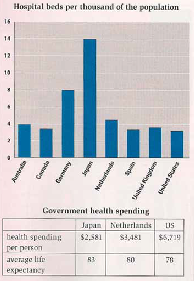
The chart and table below give information about healthcare resources and life expectancy in different countries.
Answer:
The two given charts show the facts regarding to health and medical care in different countries.
Let's look at the first chart which the number of sharing hospital beds is 14 thousand from Japan. As seen, Germany and Netherlands come second and third in the next allocation, with at 8 and nearly 5 thousand beds of population. While Australia has a slight point below the Netherlands, this country leads UK, Canada, Spain and USA which supply the lowest quantities of hospital beds, at around 4 per thousand.
At the second chart, official governments of different countries show the amount of money spent. In this section, the Dutch government come the highest one of $3,48 grant, which leads US and Japan spending $6,719 and $2,581 of fund programme. However, Japanese uplifts the best grade point average in 83 years of life expectancy rather than Dutch with 80 years and 78 years of American people.
Clearly, by comparison with the other countries, Japan spending less money to its citizens as fund programme for medical and healthcare provides more beds for patients and life expectancy.

Hospital_beds.png
