information from the chart
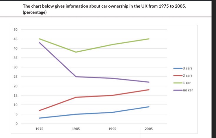
The line chart belows illustrates the percentage of owning private car in the UK over a period of 10 years from 1975 to 2005.
Overall, It is clear that while the proportion of people having one car, 2 cars and 3 cars increased, the opposite is true for no-car households. Also, no-car household in the UK experienced the biggest change over the period shown.
In 1975, no-car households and one-car households both started at approximately 45%, but later decreased to 38% and 25% of one-car households and no-car households respectively in 1985. After that, there was a significant rise to 45% of one-car households in 2005, also it is the highest point of the period shown while the year 2005 saw a marginal decreased to 22% of no-car households.
Starting at nearly 8% in 1975, the number of people who owned 2 cars increased slightly to just under 15% then rose to 18% in the end of the period. Also, the figures for people who had 3 cars increased gradually from under 5% to 10% in 2005
(177 words)
How much do you think I'll score for this on a 9 band scale

127912627_2886978692.jpg
