Unanswered [0]
  

Home / Writing Feedback   % width   Posts: 6


The chart compares the outcomes of a research on the customers' buying and drink habits in Australia


elalan 1 / 2  
Apr 16, 2022   #1

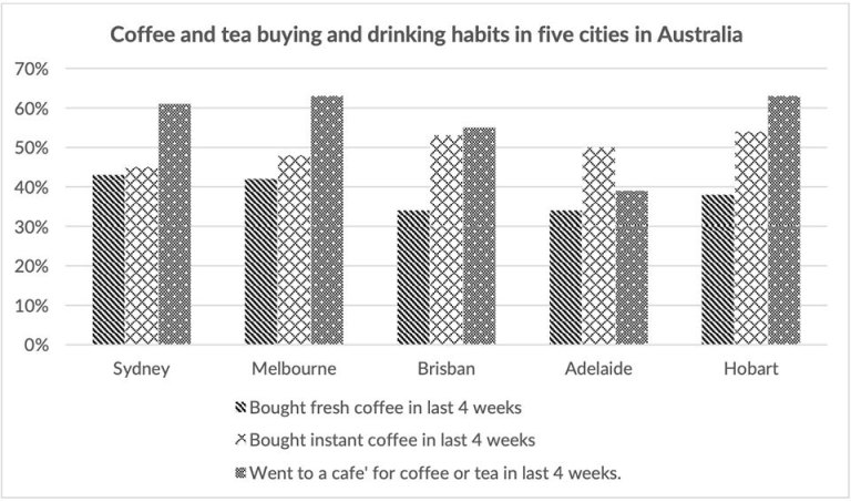
The chart below shows the results of a survey about people's coffee and tea


The chart compares the outcomes of a research on the customers' buying and drink habits in five Australian cities.

It is clear that most people in these five cities like drinking coffee. Moreover, these coffee consumers preferred to go to a cafe rather than purchasing fresh or instant coffee in the past four weeks.

Buying coffee or tea in a cafe is the most popular among people in Sydney,Melbourne,Brisdane and Hobart, which accounts for approximately 61%,64%,55% and 63% respectively. By contrast, fresh coffee is not welcomed in all five cities, especially in Brishbane and Adelaide, whose proportion is both lower than 35%, at only 34%.

The percentage of consumers in these cities who use instant coffee ranks the second, except in Adelaide, where half of people drink instant coffee and this figure is just 1% higher than drinking in the cafe. Meanwhile, Hobart sees the largest amount of instant coffee,with the share of 54%.

  • 336189_1_o.jpg


Holt  Educational Consultant - / 15463  
Apr 16, 2022   #2
The writer has not completed A thorough score increasing analysis of the presentation. An adequate investigative presentation should be at least 175 rather than 154 words only. While the latter is a little above the minimum word count, it is not enough to show the full writing range of the author. Something best achieved with the former word count.

Clearly identify the type of chart indicated as the image to help define how the information was presented. Each chart type has a specific function so it is better to be clear about it in relation to task accuracy early on. A quick listing of the 5 cities in the summary will also help add to the clarity of the trending statement. The trending statement would have also benefitted from the mention of highs and lows with regard to duect cities being mentioned. Both sections would have gotten a scoring boost if these messing presentation data were included.

The writer will get a failing L R score due to his lack of spelling expertise. He did not even bother to double check the correct spelling for Brisbane in the chart. He spelled it incorrectly several times in various paragraphs. Neither did he use proper word spacing when using commas which will result in GRA deductions.
OP elalan 1 / 2  
Apr 16, 2022   #3
@Holt
thank you ver much! I will correct these mistakes. Do I need to improve the last two paragraphs of my paper?
Lemonade312 1 / 4  
Apr 18, 2022   #4
@elalan
Hello! Sorry to interrupt, I can provide some little suggestions about your task 1 questions. But I must say that I cannot gave professional advices, because I am also suffered by task 1 questions...

First of all, the last sentence in paragraph 3, why people who buy fresh coffee(in Sydney, Melbourne, Brisbane and Hobart) was contrasted to ones buying coffee or tea in a cafe(in Brisbane and Adelaide)? I think it will be more proper to contrast that buying coffees or tea in a cafe in Adelaide, considered it is not buying drinks in a cafe is the most popular one in Adelaide(it was instant coffee instead).

And the sentences in paragraph 4 is quite hard to understand...it may be improved by emphasizing that buying instant coffee is the most popular option to citizens in Adelaide, and contrasting to other options in Adelaide, since the figures of buying instant coffee were not the highest compared to other cities. Also, as long as I could not use a ruler to measure, why Hobart had the largest percentage of people who buys instant coffee? It seems that it has the same percentage with Brisbane...

I have no further questions, I hope my advise could help.
OP elalan 1 / 2  
Apr 18, 2022   #5
@Lemonade312
Thank you very much! Your suggestions are very useful to me. I think your methods that classify them by different cities are better! I classify paragraph3&4 by just different coffee options and I find it is hard to write wonderfully.
Lemonade312 1 / 4  
Apr 19, 2022   #6
@elalan
You're welcome! I'm glad I could help you.


Home / Writing Feedback / The chart compares the outcomes of a research on the customers' buying and drink habits in Australia
ⓘ Need Writing or Editing Help?
Fill out one of these forms for professional help:

Best Writing Service:
CustomPapers form ◳

Graduate Writing / Editing:
GraduateWriter form ◳

Excellence in Editing:
Rose Editing ◳

AI-Paper Rewriting:
Robot Rewrite ◳