the bar chart report
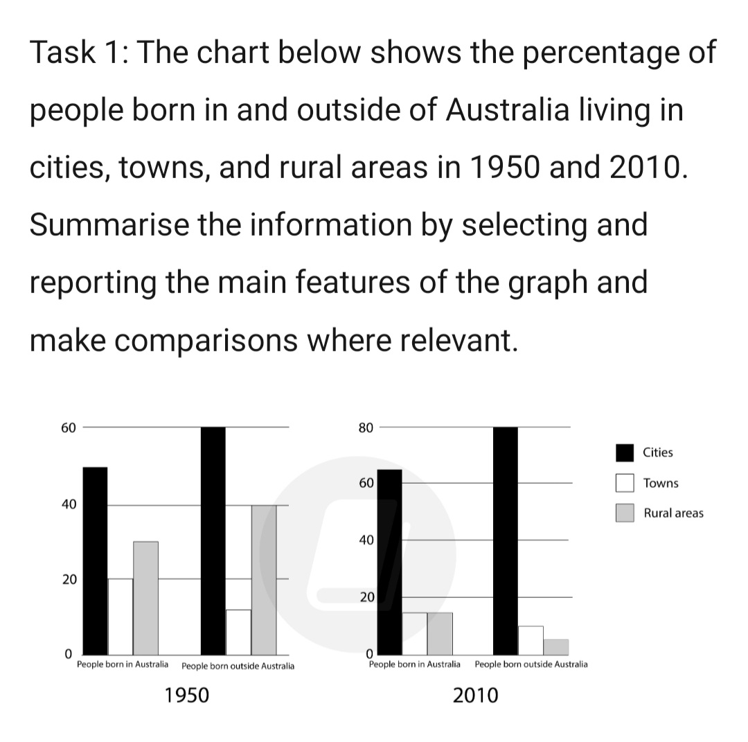
The given bar chart illustrates the percentage of Australian citizens that were born in and outside of Australia living in metropolitan areas, towns, and rural areas in 2 years 1950 and 2010.
Generally, the figures of people living in cities rose while it can be seen the opposite patterns from those who live in towns and rural areas.
Concerning people born in Australia, the percentage rose slightly from 50% to over 60% over there years! The percentage of people living in towns experienced a decrease of 5% to 15% in 2010, which was the same figure as people in the countryside after dropping twofold from 30% in 1950.
As can be seen from people born outside of Australia, city inhabitants reached the peak of 80% in 2010 whilst the people in towns remained stable. As for rural citizens,the figure plummeted from 40% in 1950 to approximately 5% in 2010.

task1.jpg
