Q) Please help me to evaluate this writing task
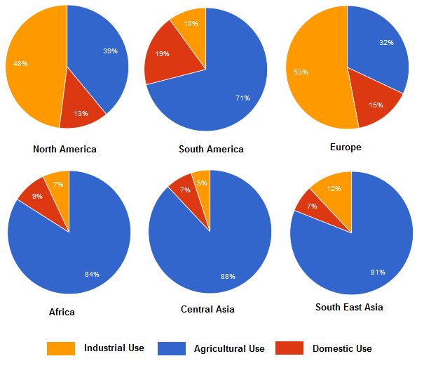
The charts below show the percentage of water used for different purposes in six areas of the world.
Summarise the information by selecting and reporting the main features, and make comparisons where relevant.
Write at least 150 words.
The given pie charts show the comparison of water usage for three important purposes in six different regions around the globe namely: North America, South America, Europe, Africa, Central Asia and South East Asia.
Overall, in four out of the six areas, the agricultural part has taken the highest percentage of water usage comparing to the industrial and domestic sectors. While both Europe and North America have consumed almost half of their water for manufacturing purposes.
In particular, in regions like Central Asia, Africa, South East Asia, and South America, they have accounted for over 70 percent of the water usage in cultivation, with 88%, 84%, 81%, and 71% respectively. Whereas both Europe and North America each have accounted for 39% and 32% of water consumption in the agricultural sector. On the other hand, the domestic use has the lowest average of nearly 12 percentage of water consumption in the whole of the six areas combined. In South America, the household usage of water took the biggest part among the rest of the six regions with only 19 percent, while in continents like Africa and Asia both have accounted for 9% and 7% respectively. In addition, after examining the data domestic use in the pie charts of both Europe (15%) and North America (13%), it is easy to notice that they have striking similarities in the three sections.
The charts below show the percentage of water used for different purposes in six areas of the world.
Summarise the information by selecting and reporting the main features, and make comparisons where relevant.
Write at least 150 words.
Purposes for using water
The given pie charts show the comparison of water usage for three important purposes in six different regions around the globe namely: North America, South America, Europe, Africa, Central Asia and South East Asia.
Overall, in four out of the six areas, the agricultural part has taken the highest percentage of water usage comparing to the industrial and domestic sectors. While both Europe and North America have consumed almost half of their water for manufacturing purposes.
In particular, in regions like Central Asia, Africa, South East Asia, and South America, they have accounted for over 70 percent of the water usage in cultivation, with 88%, 84%, 81%, and 71% respectively. Whereas both Europe and North America each have accounted for 39% and 32% of water consumption in the agricultural sector. On the other hand, the domestic use has the lowest average of nearly 12 percentage of water consumption in the whole of the six areas combined. In South America, the household usage of water took the biggest part among the rest of the six regions with only 19 percent, while in continents like Africa and Asia both have accounted for 9% and 7% respectively. In addition, after examining the data domestic use in the pie charts of both Europe (15%) and North America (13%), it is easy to notice that they have striking similarities in the three sections.

percentageofwater.png
