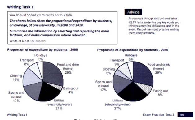
The charts below show the proportion of expenditure by students, on average, at one university, in 2000 and 2010.
Summarise the information by selecting and reporting the main features, and make comparisons where relevant.
The pie charts depict the average spending on various activities by students at a university for the year 2000 and 2010.
In general, it can be seen that the expenses on food and drink, and utilities were the highest for both the given years, while students spent the least on holidays for both years. Beside that, expenditure for some sections increased whereas others were equal or declined.
Food and drink was the largest part of the overall expenditure in 2000 and remained the same in 2010 too. Students spent just below one-fifths (17%) of their total expenses on sports and cultural activities in 2000, which was also unvaried in 2010. Meanwhile, only 5% of the total spending was on holidays in 2000 as well as in 2010 by university students.
Students spent around 8% and 21% on transport and utilities, respectively, in the year 2000, which rose considerably by 1% and 6% in 2010. The expenses incurred on eating out were only 4% in 2000, the lowest for the year; however, it doubled in the 10-year period and stood at 8% in 2010. Expenditure on clothing by students, on the other hand, dropped significantly from 16% in 2000 to just 5% in 2010.

IMG_20230221_163315..jpg
