IELTS WRITING TASK 1 - Pie charts
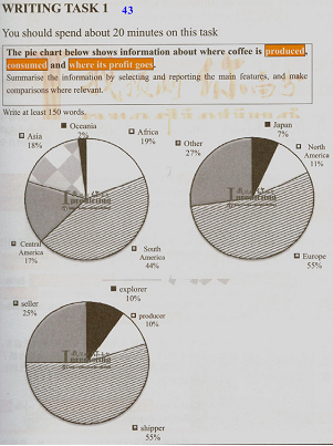
The pie charts given illustrate the countries where they have coffee harvest and coffee consumption. The figures also mention the economic outcome from coffee in different stages of production. Overall, the place with the high rate of coffee produced was not equivalent to a high rate of using or making a profit.
South America was responsible for the greatest rate of coffee production, 44% to be precise, while that only reached to nearly a half with 17% in Central America. Interestingly, when combined, the figure for South America still beat those for the remaining nations by 5%. In terms of consumption, it was reported that Europe had the first rank of spending on coffee at 55%, whereas, only 27% of that was contributed by other country, followed by North America and Japan, 11% and 7% respectively.
Interestingly, according to the last figure, total earning for the producer and explorer just was under a half of the seller, which reached to 25%. Nevertheless, the shipper by far accounted for the highest proportion of total profits among these states with 55%.

Pie_13.png
