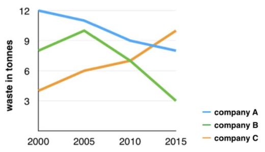
The line chart illustrates the debris created by three companies from 2000 to 2015.
It is clear that there has been a dramatic change in the amount of waste across all three companies. Between 2000 and 2015, the amount of waste produced by companies A and B decreased, while in contrast, that produced by company C significantly increased.
In 2000, the waste output of company A was 12 tonnes, which was three times as much as that of company C. At the same time, company B created about 8 tonnes, which was in the middle of companies A and B. In the next five years, the waste production of company A declined slightly from 12 to 11, while the amount of waste produced by companies B and C witnessed a sharp rise.
From 2005 to 2015, there was a rapid decrease in the waste output of companies A and B. On the contrary, company C produced much more waste production in this period. In 2015, the waste output created by company C rose rapidly, while the amount of waste produced by companies A and B went down significantly.

Graph.JPG
