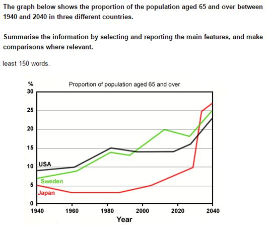
A breakdown of the proportion of elderly people from 1940 to 2040 as a forecast year, a 100-period year is presented in the line chart. The data is carried out from USA, Sweden, and Japan.
Overall, it is clearly seen that the percentage of people aged 65 and more is predicted to increase. In any case, although figure the number of people aged 65 or more in Japan experienced the lowest one in the first year, this figure is overseen to surpass and becomes the greatest one.
To begin, there was a huge changes between the first and the last view year. 1940 showed that all of the figure stood at just under 10%, which Japan societies was the least. On the other hand, all of the levels increased significantly and showed a reserve. The percentage of USA inhabitants witnessed the lowest one at approximately 23%, while figure for Japan reached a high of virtually 27%. the level of more-or-65-aged-Sweden population was between them.
Next, there was were an increasing and surpassing in the middle year. From 1960 to 2020, both the ageing population in USA and Sweden mounted slightly but fluctuated, while the level of Japan fell gradually but surpassed the other ones in 2030.

dfgh.png
