The charts below give information about the diet and general health of two groups of students. Summarise the information by selecting and reporting the main features and make comparisons where relevant.
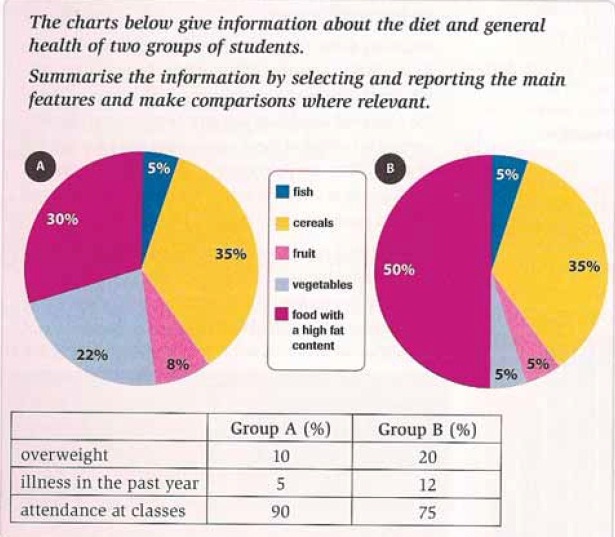
The pie charts show the type of food which eaten by both of two groups of pupils, while the table describes information about something related to their health.
Generally, it can be seen from the charts and table that containing of food affect to the healthiness. More they consume unhealthy food, more health problem they get.
The pie charts show the type of food with high fat content placed in first position in Group B, it is half portion of the pie chart. Moreover, in Group A still in the high proportion but slightly smaller than Group B by the difference 15%. Then, Group A eat many vegetables and fruits with the percentage are 22% and 8% compared with Group B, consumption of veggies and fruits are just 5%. Interestingly, consumption of cereals and fish in both of groups have the same proportions, at 35% and 5 %.
Moving onto the table, it describes the effect of consuming many types of foods to their health. First, in Group A the percentage of overweight and illness in past year a much lower than Group B by the difference around twofold. Furthermore, many of students in Group A attendance at classes with the percentage is 90 % but in Group B, percent of students who attendance at classes is just 75%.
Overall, it is clear that too many consume unhealthy foods give many bad effects to children's health, mainly for their attendance rate at school.

diagrams.jpg
