Unanswered [1] | Urgent [0]
  

Home / Writing Feedback   % width   Posts: 5


The differences in wheat exports among Australia, Canada and European Community from 1985 to 1990


Azure11o2 1 / 1  
May 20, 2021   #1

wheat exports analysis


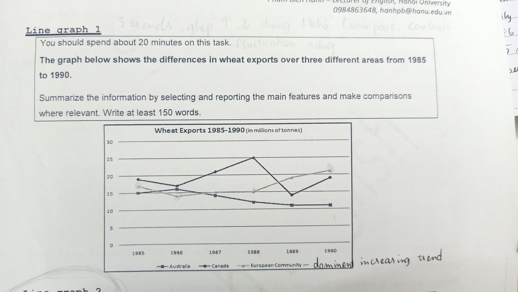
The graph illustrates the differences in wheat exports among Australia, Canada and European Community from 1985 to 1990. Overall, it is clear that there were three different trends over this period: upward, downward and fluctuation.

Looking at the details, European Community, with starting point at 15 million tons of wheat in 1985, had experienced a dip in 1986 at nearly 15 million tons. Subsequently, having been stay the same between 1987 and 1988, European exported wheats increased substantially at over 20 million tons, and remained the dominant increasing trend. In contrast, in Australia, the figure was slightly rose to 15 million tons in 1986, followed by a gradual decrease approximately 11 million tons 4 years later.

In Canada, there was a considerable fluctuation over the period. In 1985, Canada was the highest position in wheat exports roughly 20 million tons. Then, from a minimal decline in 1986, Canada had reached its peak at 25 million tons. Following this, having been decreased exponentially of under 15 million tons in 1989, Canada had bounced back at around 20 million tons in a next year.

  • 189005589_4701219107.jpg


Holt  Educational Consultant - / 15344  
May 21, 2021   #2
Your summary is over summarized to the point where no relevant data or proper trending statement is provided. It lacks accurate image identification, measurement reference, and a singular . tend you want to call attention to for comparison purposes. your summary indicates nothing of importance or information to the reader. The summary overview needs an actual reference to . capsules of relevant information.

While the presentation is acceptable, there is a lack of connecting information in the second paragraph. Where is the commonality as indicated by the aligned points in the graph? Deeper analysis is required for this graph based on 1986 data. This is a specific comparison point that better illustrates how you studied the data.
Salimakmur 2 / 6  
May 21, 2021   #3
In the first paragraph, called intro, where you paraphrase the graph's title, you can use place, time, unit, subject and chart type to make the paraphrase easier. example: use "between 1985 and 1990" instead of from 1985 to 1990"

The second paragraph consists of the overview of the graph by mentioning the highest (peak), the lowest and unique and noticeable data. I can't see the overview of your work. Maybe this is "Overall, it is clear (...) and fluctuation" I think this needs more explanation.

The third and fourth paragraph is consist of the main body where you explain the data. Since this graph shows a dynamic: multiple time frame, it is better to explain it chronologically.

This is just based on my experience of learning, and I hope it helps you.
Normie 3 / 12  
May 21, 2021   #4
-There is several minor grammar errors in your essay.
"European exported wheats increased ...
"in Australia, the figure was slightly rose to ...
- Three successive sentence begin with the same word. You should consider rewording the senctence or use a therausus to find a synonym.
"In contrast, ...
In Canada, ...
In 1985, ..."
OP Azure11o2 1 / 1  
May 23, 2021   #5
@Normie Thank you so much for your recommendation !!

@Salimakmur Thank you for helping me


Home / Writing Feedback / The differences in wheat exports among Australia, Canada and European Community from 1985 to 1990
Do You Need
Academic Writing
or Editing Help?
Need professional help with your assignments? Fill out one of these forms:

Graduate Writing / Editing:
GraduateWriter form ◳

Best Essay Service:
CustomPapers form ◳

Excellence in Editing:
Rose Editing ◳

AI-Paper Rewriting:
Robot Rewrite ◳