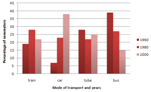
The graph below shows the different modes of transport used to travel to and from work in one European city in 1960, 1980 and 2000.
Write a report for a university lecturer describing the information below.
My writing
The bar chart indicates certain types pf transport used to commute in one European city during the 1980-2000 period.
As can be seen clearly from the chart, while there were more people using car, the reverse result was for bus.
The proportion of people utilizing train was approximately 20% in 1960, then there was a noticable growth in the next 20 years to 27%, which followed by a decline to 22% in 2000. The figure for tube made up above 25% at the beginning of the period, later dropped to almost 20% in 1980 and witnessed a recovery to excactly 25% in 2000.
As for car data, it only accounted for under 10% of commuters initially. Twenty years later, there was a dramatic increase to 23%, followed by another sharp rocket to above 35% in 2000. In contrast, bus was the most common transport in 1960 with approximately 40% users, which underwent two rapid downfalls in the following 20 and 40 years, with 26% and 15% respectively.
All feedbacks are going to be held of value by me.
Write a report for a university lecturer describing the information below.
The proportion of people and their commuting method
My writing
The bar chart indicates certain types pf transport used to commute in one European city during the 1980-2000 period.
As can be seen clearly from the chart, while there were more people using car, the reverse result was for bus.
The proportion of people utilizing train was approximately 20% in 1960, then there was a noticable growth in the next 20 years to 27%, which followed by a decline to 22% in 2000. The figure for tube made up above 25% at the beginning of the period, later dropped to almost 20% in 1980 and witnessed a recovery to excactly 25% in 2000.
As for car data, it only accounted for under 10% of commuters initially. Twenty years later, there was a dramatic increase to 23%, followed by another sharp rocket to above 35% in 2000. In contrast, bus was the most common transport in 1960 with approximately 40% users, which underwent two rapid downfalls in the following 20 and 40 years, with 26% and 15% respectively.
All feedbacks are going to be held of value by me.

mt2017octpt11.gif
