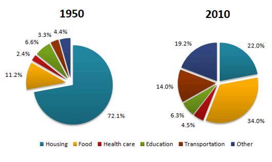
The pie charts below show the average household expenditures in a country in 1950 and 2010.
A comparison of the percentage household spending in a country between two different years,1950 and 2010, is illustrated in pie charts. At first glance, it is inevitable that there were significant change in the percentage of household spending at several different sectors. While the percentage of housing expenditure decreased significantly, food spending showed the opposite.
Moving to detailed analysis, the percentage of housing expenditure showed a dramatic decrease over a 60-year period, stood at 72.1% in 1950 and fell extremely around a half at 22 percent in 2010 which was followed by education which decreased slightly at 6.6% to be at 6.3 percent. By contrast, the percentage of food spending increased significantly from 11.2 percent to more than a third in the same period.
Turning to the next data, the percentage of transportation expenditure showed a rise around one in ten percent, 3.3% in 1950 to 14 percent in 2010. Then, it was followed by health care which increased at a small amount. 19.2% of increase is presented by other sectors over that period.

Task_26_The_average_.jpg
