Unanswered [1] | Urgent [0]
  

Home / Writing Feedback   % width   Posts: 3


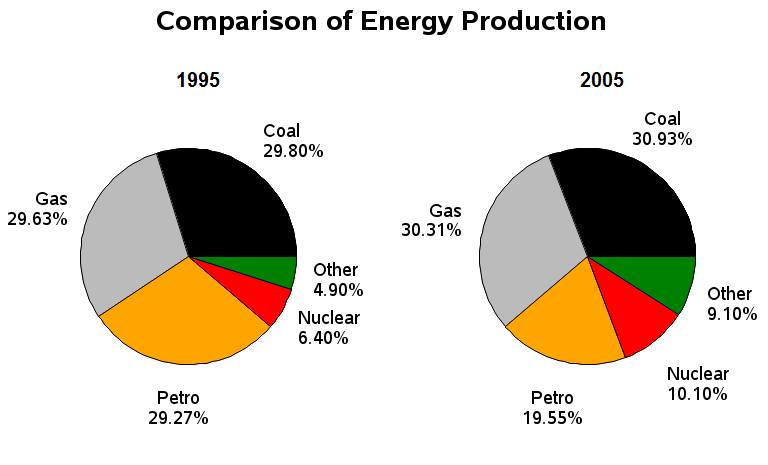
Different proportions of energy production sources in two years 1995 and 2005.


linsielee 1 / -  
Apr 27, 2021   #1

Comparison of energy production (pie charts)


The given pie charts compare the percentages of different kinds of energy production between two years: 1995 and 2005.
It can be seen obviously in the charts that the energy produced from two sources namely coal and gas made up the largest share in both years, while the figures for nuclear and other energy production were the smallest.

In detail, the energy produced from coal accounted for 29.80% of the total energy production, which was the highest proportion in 1995, and this figure underwent a slight increase to 30.93% in 2005. Similarly, the second-largest percentage was accounted for by Gas in both years, at 29.63% in 1995 and this proportion increased slightly by nearly 1% to 30.31% in 2005. The figures for nuclear and other energy production were much lower, accounted for 6.40% and 4.90% in 1995. These proportions experienced a modest increase of about 5% to 10.10% and 9.10% in 2005. However, they were still 2 sources that made up the smallest share in both years. In contrast, the percentage of Petrol underwent a reverse trend. The energy produced from Petrol accounted for 29.27% in 1995 but decreased sharply by nearly 10% to 19.55 in 2005

  • Piechart.jpg


Holt  Educational Consultant - / 15384  
Apr 28, 2021   #2
When discussing more than one pie chart, always indicate the number of charts included to help the reader get a better idea of how the information presentation is divided. The same goes for the trending statements. You must clearly indicate which trend goes with which chart. You cannot simply state the trends collectively and hope that the reader will know how to separate and classify the information you are providing. You must do that yourself as part of the Task Accuracy consideration for your presentation.

This is a 3 paragraph presentation essay due to the 2 images provided. Each image must have a comprehensive information and discussion presentation in stand alone paragraphs. The presentation you used lost clarity because of the lack of information division between images. Name the images. Pie chart 1 covers what information? Then pie chart 2? Remember the audience you are writing for. They need to be able to create a mental image of what you are trying to report on.

Using the years indicated in the same paragraph makes it difficult to classify the information. Hence the need for singular paragraphs specific to the year you are discussing. The comparative discussion could be better presented as a part of the trending statement, where the successive comparisons would make more sense.

Though your information presentation is accurate for the most part, the lack of clarity and confusing information presentation format per image is what will hold back your final score.
Himyfr 1 / 1  
May 5, 2021   #3
You used the words 'account for' too much. I think you should use other phrases like make up, constitute, contribute...

There may be a wrong thing here:
the second-largest percentage was accounted for by share belonged to Gas (I suggest that because I think it sounds more sense)

they were still 2 sources => the two remaining sectors made up...


Home / Writing Feedback / Different proportions of energy production sources in two years 1995 and 2005.
Do You Need
Academic Writing
or Editing Help?
Fill out one of these forms:

Graduate Writing / Editing:
GraduateWriter form ◳

Best Essay Service:
CustomPapers form ◳

Excellence in Editing:
Rose Editing ◳

AI-Paper Rewriting:
Robot Rewrite ◳

Academic AI Writer:
Custom AI Writer ◳