Unanswered [1] | Urgent [0]
  

Home / Writing Feedback   % width   Posts: 3


Energy consumption by the fuel - line chart in ielts writing task 1


hoanglinh220301 1 / -  
Jun 24, 2022   #1

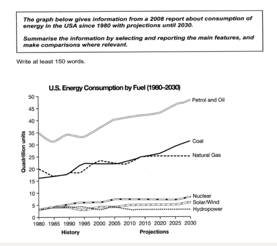
us energy chart


The line graph illustrates the energy consumption by the fuel of the United States from 1980 to 2030.
Overall, petrol and oil were consumed the most, and they have burgeoned from 1990 until 2030. Although coal was not used as much as petrol and oil, its development rate still increases from 1980 to now. The other fuels do not fluctuate too much, most of them were stably expended.

Nuclear, solar/wind and hydropower remain below 15 quadrillions. Hydropower was expended at least, it fluctuated from 1980 to 2010 but after that, this fuel does not have many changes. Nuclear and solar/wind have little change before 2005, then they stay level of expending, finally, they have some sign of progress from 2025.

Coal and natural gas are the second most common fuel. While coal rises every year, the development rate of natural gas is not volatile since 2015.

Petrol and oil dropped to 30 quadrillions in 1985, however, it develops stably until now. In addition, petrol and oil increase quickly between 1995 and 2020. The highest consumption is predicted about 50 quadrillions in 2030.

  • Screenshot215.png


Holt  Educational Consultant - / 15384  
Jun 24, 2022   #2
The trending statement is overdone. It is referencing the wrong trend as well. The trending projection should be indicative of the year 2030 trend since that is the last part of the comparison presentation. The year sequence "now" is also not right since the line graph measurements do not end in 2022. Measurement units should also be established in the summary overview.

When writing a report or analysis, one must indicate the measurements as mentioned in the graph. A more appropriate analysis can only be achieved if proper numerical data is provided. General estimates do not accomplish the necessary reporting and analysis paragraphs. It makes the presentation less than informative. A clear comparison presentation must be established.

As far as effective task 1 presentations go, this one does not effectively achieve the purposes required of the essay.
beckaa 3 / 7  
Jun 24, 2022   #3
The line graph doesn't end at the moment but continues to the future so I don't think the sentence "it develops stably until now" reflects the best what you are trying to infer.


Home / Writing Feedback / Energy consumption by the fuel - line chart in ielts writing task 1
Do You Need
Academic Writing
or Editing Help?
Fill out one of these forms:

Graduate Writing / Editing:
GraduateWriter form ◳

Best Essay Service:
CustomPapers form ◳

Excellence in Editing:
Rose Editing ◳

AI-Paper Rewriting:
Robot Rewrite ◳

Academic AI Writer:
Custom AI Writer ◳