Unanswered [0]
  

Home / Writing Feedback   % width   Posts: 4


Energy Production Chart In America


giahuy141 1 / -  
Apr 3, 2017   #1

the amount of energy produced in the usa


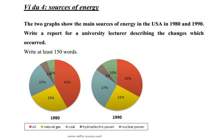
The charts provide information about the amount of energy produced by five important sources in America over the course of 10 years, beginning in 1980.
Looking at the charts, it is immediately obvious that there was relatively little change in the proportions of the other fuels used to generate energy from 1980 to 1990, except for hydro. It is also noticed that Coal was the main source in both years.

In 1980, 42% of energy production came from oil and the figure decreased to 25% in ten years latter. By contrast, the proportion of natural gas used as a source for manufacturing energy, which remained almost stable at 26% in 1980, with 25% in 1990. However, coal experienced a slight decrease from 22% in 1980 to 27% in 1990, which overtook the rate of natural gas.

On the other hand, the amount of hydroelectric power remained constantly at 5% of the total in both years, which was its lowest point during the whole pie charts. Finally, in 1990, the nuclear power went up by 5% from the 1980 figure of 5%.

  • Capture.PNG


Holt  Educational Consultant - / 15492  
Apr 3, 2017   #2
Truong, there is a specific format that has to be followed when writing a summary essay for a lecturer. The tone needs to be more academic in nature and also, provides a respectful deference towards the target reader. Therefore, the opening sentence for this essay should have sounded something like this:

America consumes energy coming from 5 different sources. In order to better understand the method by which the country consumes power, one must first analyze the amount of energy consumed per resource. This essay shall shed light on the five sources of power, making percentage comparisons where necessary for energy consumed during the decades of 1980 and 1990 using 2 previously provided pie charts.

Note, the academic research tone of the opening statement. Since this paper is to be presented to a university lecturer, a clear thesis statement and outline of discussion, plus the preliminary sources of information must be provided. Consider this sort of a thesis statement presentation. The academic tone must be consistent throughout the essay and also, clearly discuss the sources of energy in a chronological manner, either from biggest to smallest or smallest to biggest. The comparisons are necessary whenever the gap between uses of the same energy source is up to one percent in difference.

Now, based upon the example given above, I am sure that you noticed the shortcoming of your summary statement. Make sure to pattern your future writing, regardless of the target audience, after the example above. The lecturer reader should be assumed in all of your writing in order to create a stronger summary statement every time. The same goes for your concluding sentence. It is short of the 3 sentence minimum requirement. Always do your best to accurately divide the discussion topics so that you will not be left short of the required sentence count towards the end of the essay.

The tone of your essay is also highly mechanical in nature. It is obvious that you only wanted to present the information provided, you did not want to delve deeper and give a more detailed analysis of the charts even though the opportunity to do so existed. I hate to say this but for every short cut you took and every mechanical detail you presented, I had to mark down your essay. The marking down reached the point where the overall score of your essay was reduced to a 5. The strongest reason for the markdown was the mechanical nature of your presentation and lack of presentation development when it came to the provided data.
akbarmappiare 31 / 445  
Apr 3, 2017   #3
Hi Truong, I have read your writing closely and found that you needed a few improvements.
Firstly, harness proper linking words to keep cohesion of your writing. If you wanna display an overview, you can use an intro "Overall, it is important to note". Following that, your score is gonna fall down because you deliver the wrong information in the overview. You said that Coal is the main source although it clearly seemed that Oil is the primary source. Be careful of picking the data.

Turning to your body paragraph, honestly your description is less interesting because you did not compare figures each other. On condition that you wanna get a high score, you are supposed to compare them. For example,

"Initially, coal broke a record as the highest percentage of energy used in America, representing at 42%. Meanwhile, hydroelectric and nuclear power were only generated less than an eightieth of coal's percentage."

Actually, your writing is a good job, but it's better if you display comparisons in each paragraph and deliver a variety of vocabulary to get the high score

Hopefully, my corrections can finalize your writing.
GOOD LUCK
muathuthattuyet 5 / 4  
Apr 8, 2017   #4
it is immediately obvious

in the proportion of the other fuels

the main source of energy

in ten years latter


Home / Writing Feedback / Energy Production Chart In America
ⓘ Need Writing or Editing Help?
Fill out one of these forms for professional help:

Best Writing Service:
CustomPapers form ◳

Graduate Writing / Editing:
GraduateWriter form ◳

Excellence in Editing:
Rose Editing ◳

AI-Paper Rewriting:
Robot Rewrite ◳