Unanswered [0]
  

Home / Writing Feedback   % width   Posts: 2


Flu Rates for Males and Females


Yulia Indah 4 / 6  
May 1, 2020   #1

The statistics of flu among men and women


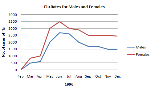
The chart shows the information regarding the prevalence rates of flu in males and females since 1996.

Overall, it could be noticeably seen that the flu rates increased considerably in males and females with the same pattern over the period shown. The figure appears the cases of female had slightly higher than that of the male over a period from February to December.

Turning to the flu rate of females, we can see that the number of female prevalence suddenly rose between February to June, then reached the peak on 3.500 (number cases of flu). Furthermore, it markedly declined till the number cases of flu under 2500 on December.

Likewise, the prevalence rates of males, it is shown that five months later, exactly on June, the number of male cases jumped to around 2.750 (the number of cases of flu) before it slightly declined to 1500 cases of flu on December.

  • FlueRatesforMales.jpg


Holt  Educational Consultant - / 15466  
May 2, 2020   #2
By writing only 152 words, you are showing that you have not carefully analyzed the content of the line graph. You have also not fully developed the data presentation per paragraph and, you have redundant descriptive phrase usage within the essay. These are all factors that will prevent your essay from achieving its full passing score potential.

The image provided was wrongly identified as a generic chart. The report must provide a specific image reference such as, in this case, a line graph. You must review the various types of images used in the Task 1 essay so that you can properly and accurately identify the image provided. A chart is different from a graph. You will be scored on the accuracy of your report, so you need to pay great attention to even the most minute detail of the image provided.

Information from the image is only from 1996. The original image never indicated that this was a progressive yearly chart. It is a single year chart, focusing on 1996. I am afraid that the lack of accuracy in your overall reporting, of which there are several, will severely lower your TA score to the point where it will prevent you from garnering at least a passing score in the presentation.

I suggest that you review your work in this chart. It is highly inaccurate. Try to do it over, this time, focusing on the accuracy of your report. You should end up writing at least 175 words when you properly present the data from the line graph.


Home / Writing Feedback / Flu Rates for Males and Females
ⓘ Need Writing or Editing Help?
Fill out one of these forms for professional help:

Best Writing Service:
CustomPapers form ◳

Graduate Writing / Editing:
GraduateWriter form ◳

Excellence in Editing:
Rose Editing ◳

AI-Paper Rewriting:
Robot Rewrite ◳