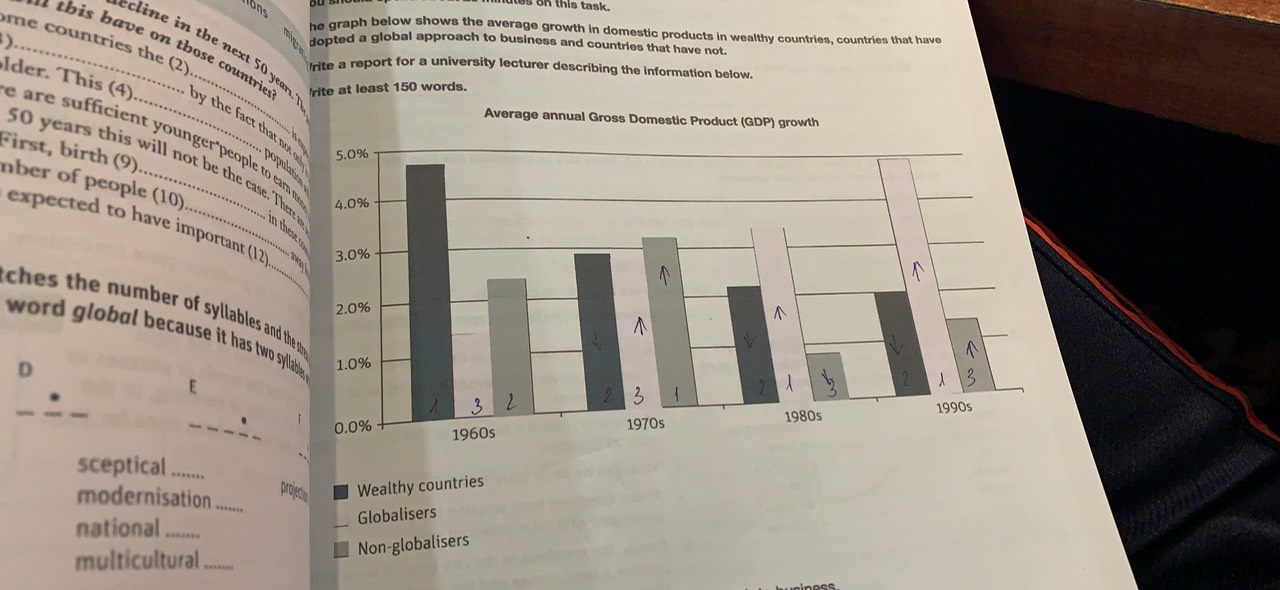
gdp - three groups of nations comparison
TOPIC: The graph below shows the average growth in domestic products in wealthy countries, countries that have adopted a global apprach to business and countries that have not.
MY ESSAY:
The bar graph gives comparison among three groups of nations' average annual growth in GDP from 1960s to 1990s.
It is apparent that there was an improvement in the number of gross domestic products of the developing countries through decades. Nevertheless, the non-globalisers lost their track during this period of time while the others did not. In terms of the developed ones, they seemed to be gradually economically slow.
In the first decade, those with either world-wide or non-worldwide pursuits began with the lowest statistics of more than 1% and 2% respectively. Despite this fact, the global approach adopters soon kept pace and had its ratio reached its peak of one-twentith in the last years.As a result, the globalisers appeared to have a potential economic status. In contrast. the highest figure for the non-globalisers had been witnessed in 1970s right after their economic outputs fluctuated to the final percentage of 1,5%.
The rich nations' data showed a downward trend over the years. Ever since the greatest decline of 2% in GDP in the 70s, the changes were unconsiderable, leading
this group's economic development proportion as halved high as the first years. In addition, it can be seen that the developed countries were still able to maintain stable prosperity.

The graph
