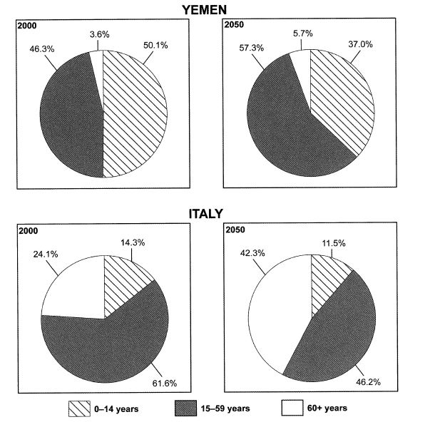
The charts below give information on the ages of the populations of Yemen and Italy in 2000 and projections for 2050. Summarise the information by selecting and reporting the main features, and make comparisons where relevant.
Given are pie charts comparing the number of inhabitants in Yemen and Italy in 2000 and their forecasting in a half century later. It is noticeable that, the adolescence and middle-aged population will increase in both of countries.
In 2000, at 46,3% of Yemen dwellers was dominated by 15-59 years group, predicted to grow exponentially in 2015, reaching at 57,3%. Conversely, having a half of percentage, the number of pupils is likely to fall at 37% later. However a slight changes of elderly population will be occurred, with just a mere 2,1% increment.
On the other hand, the majority of Italian society in 2000 was 15-59 years group, accounting at 61,6%, yet, it will be forecasted to drop at 46,2%. Surprisingly, compared with Yemen, children population in Italian just recorded three times smaller in 2000, with a steady decrease will be experienced in 2050 at 11,5%. However, just one of four citizens was the older group and will be predicted approximately twice greater, standing at 42,3%, as the second biggest population in the future.
comparison of the italian and yemeni population
Given are pie charts comparing the number of inhabitants in Yemen and Italy in 2000 and their forecasting in a half century later. It is noticeable that, the adolescence and middle-aged population will increase in both of countries.
In 2000, at 46,3% of Yemen dwellers was dominated by 15-59 years group, predicted to grow exponentially in 2015, reaching at 57,3%. Conversely, having a half of percentage, the number of pupils is likely to fall at 37% later. However a slight changes of elderly population will be occurred, with just a mere 2,1% increment.
On the other hand, the majority of Italian society in 2000 was 15-59 years group, accounting at 61,6%, yet, it will be forecasted to drop at 46,2%. Surprisingly, compared with Yemen, children population in Italian just recorded three times smaller in 2000, with a steady decrease will be experienced in 2050 at 11,5%. However, just one of four citizens was the older group and will be predicted approximately twice greater, standing at 42,3%, as the second biggest population in the future.

task_1_pie_chart.JPG
