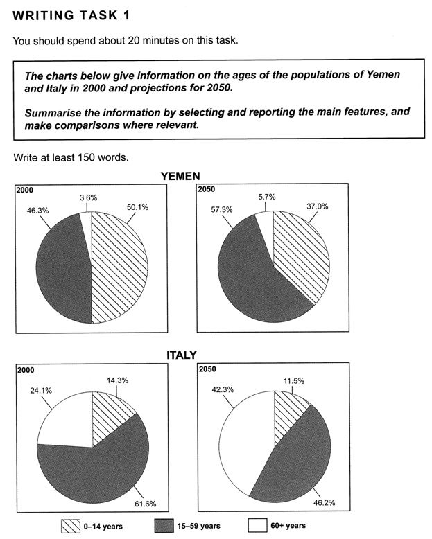
The pie charts compare the percentages of different age groups in the population of Yemen and Italy, in 2000 and expectations for 2050.
Children of ages 0-14 accounted for the majority of Yemen's population (approximately 50.1 per cent) in 2000, but their percentage is predicted to fall to 37 per cent by 2050. Surprisingly, this age group made up only a small proportion of Italy's population (about 14.3 per cent) and is expected decline by 2.8 per cent the end of the period in question.
The following age group of people, aged 15 to 59 years, accounted for nearly half of Yemen's population, and they are believed to have a major increase at the end of fifty years. In contrast, the percentage for the same group is expected to decrease dramatically (by nearly 15 per cent) in Italy.
Elderly people, who are over sixty or older, had the lowest percentage in Yemen and are to have a subtle increase, whereas in Italy they are going to grow from roughly a quarter to nearly a half of population.
To sum up, it is clear from the charts that Yemen are going to have more adults in 2050 and Italy is projected to have fewer children.

 Do You Need