Hi everyone, help me by fixing my sample. you a lot in advance!
The given pie charts depict the proportion of the standard money spent on diverse household expenses in Japan and Malaysia in 2010.
Generally speaking, it can be seen that in both countries the main categories that householders consume money for were food, housing, other goods and services. Japan's percentage figures for transportation and healthcare spending were twice as high as Malaysia's.
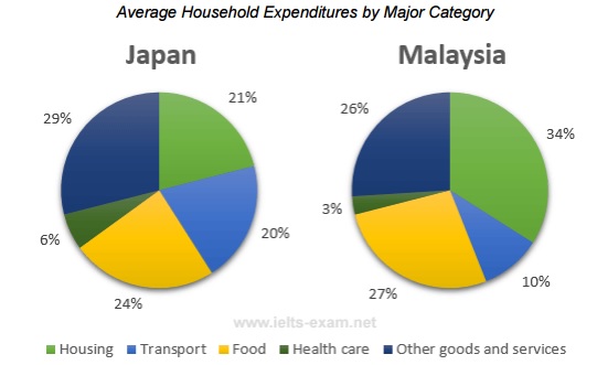
The data indicates that Malaysians spend most of their income on housing (34%), while in Japan it occupied just 21% of Japanese's expenditures. The greatest figure of expenditure in Japan was on other goods and services, accounting for 29%, which was slightly higher than that in Malaysia. In terms of food, the percentages in Japan and Malaysia were about the same, at 24% and 27% respectively.
Healthcare was the expense that people in Japan and Malaysia spent the least amount on. Another major expense in Japan was transport, which took up 20%, while money involved in commuting in Malaysia was just half of that number compared with Japan.
average household expenditures in Japan and Malaysia in the year 2010
The given pie charts depict the proportion of the standard money spent on diverse household expenses in Japan and Malaysia in 2010.
Generally speaking, it can be seen that in both countries the main categories that householders consume money for were food, housing, other goods and services. Japan's percentage figures for transportation and healthcare spending were twice as high as Malaysia's.
The data indicates that Malaysians spend most of their income on housing (34%), while in Japan it occupied just 21% of Japanese's expenditures. The greatest figure of expenditure in Japan was on other goods and services, accounting for 29%, which was slightly higher than that in Malaysia. In terms of food, the percentages in Japan and Malaysia were about the same, at 24% and 27% respectively.
Healthcare was the expense that people in Japan and Malaysia spent the least amount on. Another major expense in Japan was transport, which took up 20%, while money involved in commuting in Malaysia was just half of that number compared with Japan.

japanmalay.jpg
